


Imagine every product your brand launches being instantly recognizable, trusted, and consistent everywhere your audience looks. In 2025, a product style guide is no longer just a nice-to-have; it is the backbone for building credibility, streamlining design, and fueling your brand’s growth.
This guide will walk you through exactly what a product style guide is, why it is more important than ever, and how you can create one that sets your business apart in a fast-changing market.
You will learn the core elements to include, step-by-step content creation tips, advanced trends, real-world examples, and the best tools to make your process seamless. Ready to unlock the power of consistent branding? Let’s dive in.
What is a Product Style Guide and Why Does it Matter in 2026?
In a world crowded with brands and products, standing out is only half the challenge. Maintaining a consistent, memorable brand presence is the real test. This is where a product style guide becomes a game-changer, especially as we move into 2026.
Defining a Product Style Guide
A product style guide is a centralized document that spells out the visual elements, messaging, and user experience standards for a brand’s products. Think of it as your brand’s DNA, capturing everything from logo usage and color palettes to tone of voice and image style.
Many brands confuse a product style guide with brand guidelines or a design system. While they overlap, there are clear differences. Brand guidelines cover your overall identity, like mission, values, and overarching voice. A design system dives deeper into reusable UI (user interface) components and coding standards. The product style guide sits at the intersection, guiding how products look, sound, and feel across every touchpoint.
For cross-functional teams, the product style guide acts as a single source of truth. Designers, marketers, and developers use it to ensure every asset feels cohesive, no matter who creates it. This shared foundation keeps everyone aligned and speeds up decision-making.
The Evolving Importance in 2026
Why is a product style guide more important than ever in 2026? The answer lies in how brands operate and grow today.
With brands now spanning websites, apps, social media, packaging, and even physical stores, omnichannel consistency is critical. Customers expect the same polished experience, whether they’re browsing online or picking up a product in person.
Remote and distributed teams are now the norm. Without a brand style guide, it’s easy for teams in different locations to interpret branding in their own ways. This leads to inconsistencies that can erode trust and confuse customers.
As companies scale, launch new product lines, or expand into new markets, the product style guide provides a roadmap for adapting visual content and messaging without losing the core brand identity. It’s the difference between a brand that feels unified and one that feels scattered.
Key Benefits for Modern Brands
What can a product style guide do for your brand? The benefits go far beyond pretty visuals.
- Consistency. Every team member, from design to marketing, is working from the same playbook. This means your brand always looks and sounds the same, everywhere.
- Faster Onboarding. New hires quickly pick up your brand standards, reducing training time and errors.
- Efficiency. Clear guidelines reduce back-and-forth, minimize rework, and save resources.
- Trust and Recognition. Customers are more likely to remember and trust a brand that feels reliable and consistent.
Whether you’re a startup or a global giant, a product style manual is your secret weapon for scaling without losing your unique spark.
Supporting Data & Industry Insights
The value of a brand style guide is clear when you look at industry leaders. Dropbox, Google, Twitter, and Airbnb all rely on robust style guides to keep their branding sharp as they grow and evolve.
Consistent branding isn’t just about aesthetics. Industry research shows that brands with strong consistency across channels can increase revenue by up to 23%. According to the Lucidpress State of Brand Consistency Report, this consistency translates directly to business impact.
Brand style guides are living documents. They evolve as brands adapt to new trends, technologies, and customer expectations. The most successful brands treat their product style guide as a dynamic tool, updating it regularly to stay relevant and effective.
Core Elements of a Product Style Guide
A product style guide is only as strong as its core building blocks. These foundational elements ensure your brand looks, feels, and communicates consistently everywhere it appears. Let’s break down the must-have components every modern product style guide should include.
Design Principles and Brand Voice
At the heart of every successful product style guide are clear design principles and a well-defined brand voice. Your design principles act as a compass, guiding every visual and UX decision. They should be specific, actionable, and reflect your brand’s unique mission.
For example, Apple’s Human Interface Guidelines focus on clarity, deference, and depth. These principles are not just buzzwords — they translate into real design choices. Similarly, your brand voice should be documented in your product style guide to ensure messaging remains consistent whether in marketing copy or microcopy within your app.
When your team understands the "why" behind design decisions, it leads to more unified and effective products. Always review and refine these principles as your brand evolves.
Typography and Font Usage
Typography plays a crucial role in shaping perception and usability. Your brand style guide should set clear rules for which typefaces to use, when, and how.
Limit your selection to two or three complementary fonts to maintain visual harmony. Clearly state font weights, sizes, and usage for headers, body text, and captions. For pairing ideas, resources like Typewolf and FontPair can inspire smart combinations.
Google’s Material Design is a great example, specifying Roboto for most interfaces and detailing precise font hierarchies. By documenting these standards in your product style guide, you help designers and developers avoid confusion and keep every touchpoint on-brand.
Color Palette and Application
A consistent color palette is vital for instant recognition. Your product style guide should define primary, secondary, and accent colors, along with their intended uses.
Use clear naming conventions — like “Core Black” or “Seasonal Accent Yellow” — to avoid confusion, especially when product colors change seasonally. Apparel brands like Nike and Adidas use structured color systems that label hues by purpose: core brand colors for year-round use, and rotating palette extensions for campaigns or seasonal drops. Beauty brands such as Glossier apply strict usage rules too — their signature pink remains the dominant tone across packaging, digital, and retail touchpoints.
Accessibility is key, so always provide guidance on contrast ratios to ensure legibility across product labels, hangtags, and e-commerce visuals.
A well-structured color codes section in your product style guide prevents costly errors and keeps your brand looking sharp and consistent — whether you're shooting a capsule collection or refreshing a bestseller.
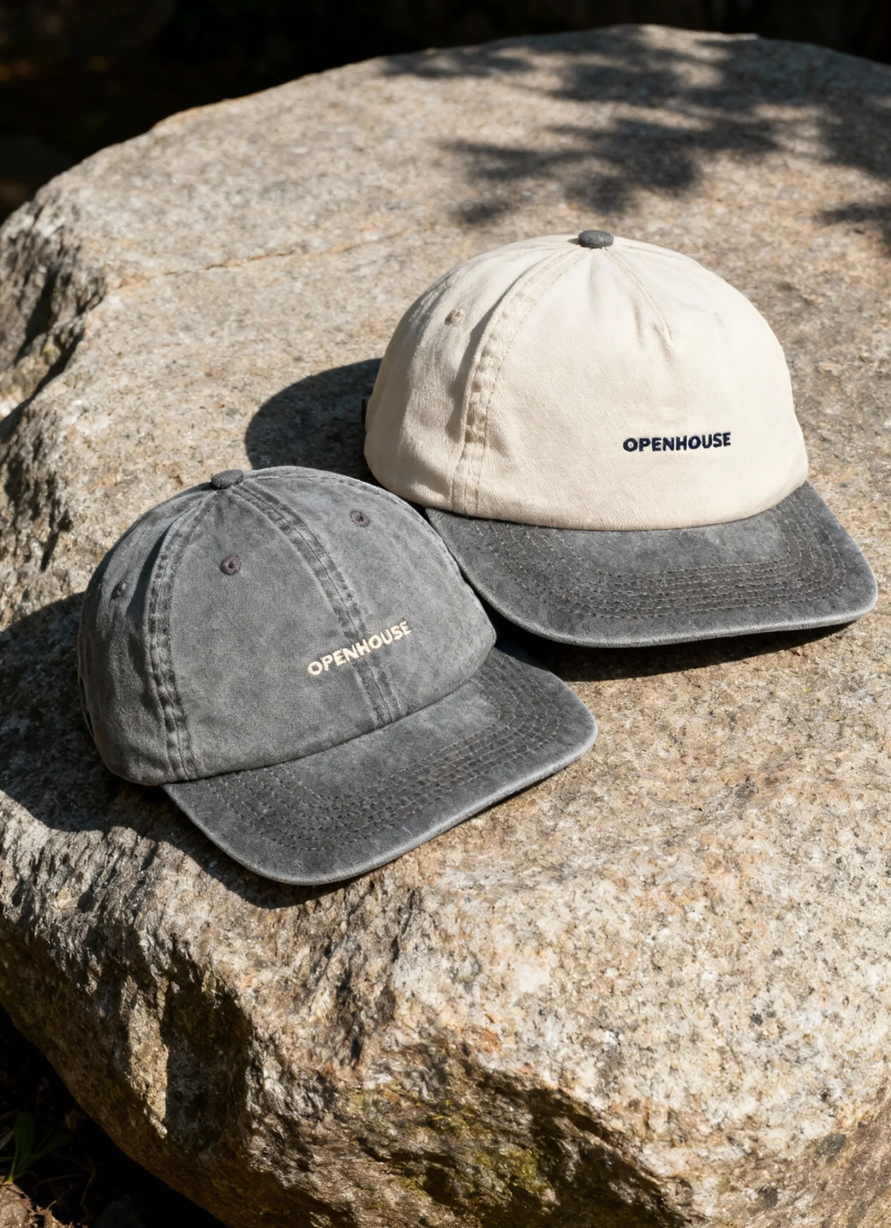
Imagery, Photography, and Iconography
Images are where your product style guide truly comes to life. Because online shoppers rely on visuals to judge quality, your guide should set clear rules for photography: angles, framing, lighting style, retouching level, and whether to use on-model, tabletop, or detail-driven macro shots.
Apparel and beauty brands that scale their e-commerce presence — from Everlane’s consistency in fit photography to Fenty Beauty’s shade-accurate macro close-ups — rely on repeatable guidelines that keep every product looking like it belongs to the same brand. When items vary widely in shape or texture, these rules eliminate guesswork and reduce costly reshoots.
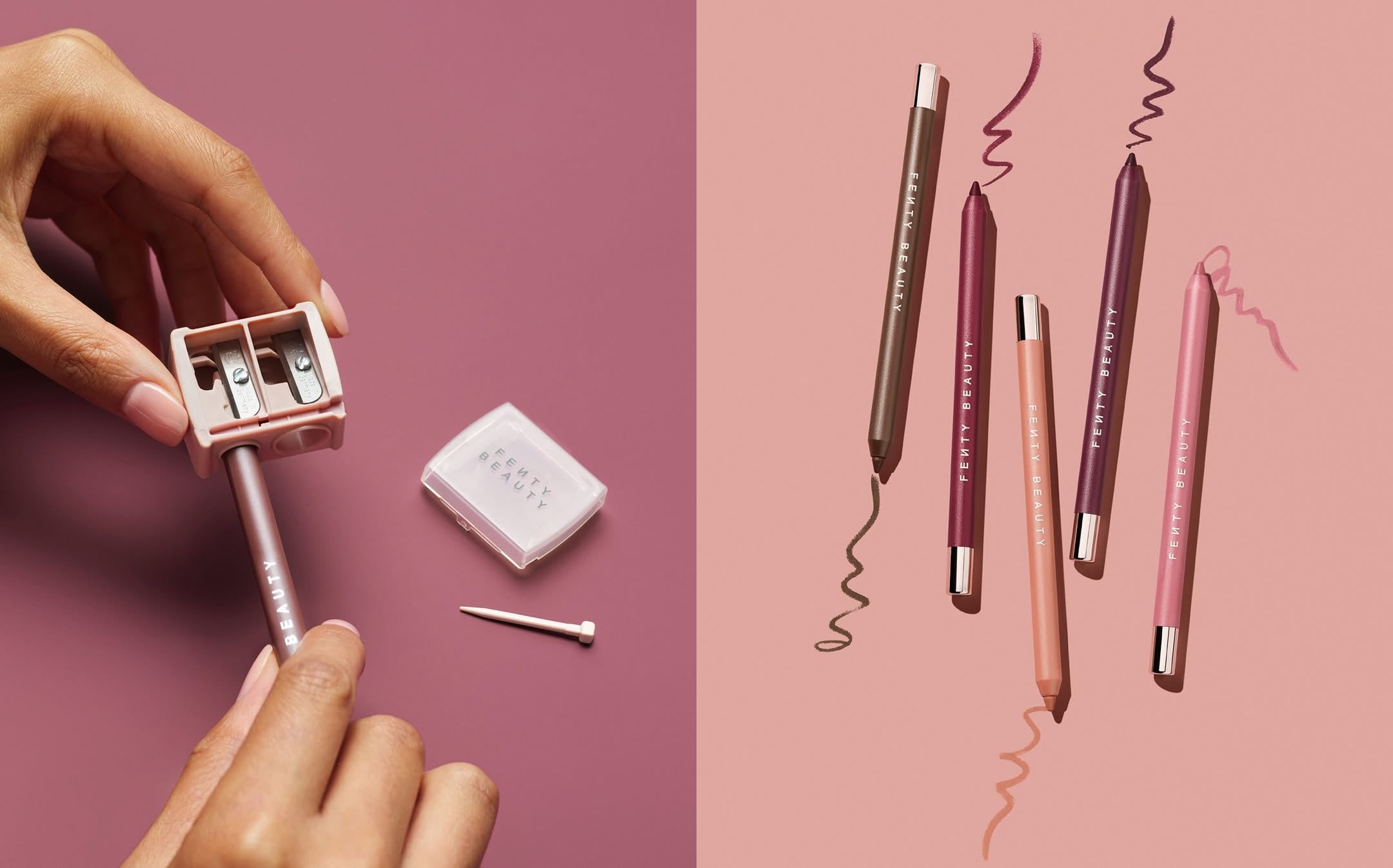
Iconography matters too. Define line weights, sizing, and spacing so icons pair cleanly with product labels and PDP layouts. Show do’s and don’ts right in the guide — visuals communicate standards faster than text.
Well-documented image standards make your content creation smoother and help every new product listing maintain the same sharp, conversion-ready look that shoppers trust.
Need help deciding which images to standardize? Check out this Guide to required product images for actionable tips on what to include in your product style guide.
Grids, Spacing, and Layout Systems
Uniformity in layout builds trust and improves user experience. Your brand style guide should define grid systems, spacing scales, and responsive breakpoints.
Set clear rules for columns, gutters, and margins. For example, Gucci’s recent Instagram campaign uses a consistent framing system: models are positioned within the same invisible columns, spaced equally, and photographed against an identical spotlight backdrop. This creates a predictable structure that keeps every post aligned — no matter the outfit or model.


Documenting standards like these in your product style guide ensures that every page and asset feels cohesive, even when multiple creators are contributing. Consistent grids and spacing not only make visuals look professional but also streamline collaboration across teams and channels.
Components and UI Patterns
Modern products rely on reusable components for speed and consistency. Your product style guide should document the key UI elements — buttons, forms, cards, modals, and more.
Each component should have visual examples, usage guidelines, and code snippets if possible. Airbnb and Mapbox excel at this, providing libraries that help teams quickly assemble new interfaces without reinventing the wheel.
Component documentation in your product style guide empowers both designers and engineers to build faster and with fewer errors. It’s the secret to scaling design across teams and products.
How to Create a Product Style Guide: Step-by-Step in 2025
Ready to build a product style guide that grows with your brand in 2025? Follow this clear, actionable process to ensure consistency, efficiency, and impact as your team and products scale.
Step 1: Audit Your Existing Brand Assets
Begin by gathering every visual element and messaging asset connected to your brand. This includes logos, color palettes, typography, imagery, and UI components. Create an inventory and look for inconsistencies or outdated brand elements. Ask, do your social media visuals match your website? Are your product visuals unified? Get feedback from design, marketing, and development teams. This audit forms the foundation for your product style guide and identifies gaps to address.
Step 2: Define Your Brand’s Core Principles and Visual Identity
Next, clarify your brand’s mission, values, and personality. These core principles will shape the direction of your product style guide and help your marketing team make decisions that reflect your identity.
Collaborate with key stakeholders. Set clear, actionable design principles and tone of voice guidelines. Make sure everyone is aligned so your product style guide truly represents your brand.
Step 3: Establish Visual Standards (Typography, Color, Imagery)
Now, it’s time to document the visual rules that will define your brand. Choose your typefaces, color palettes, and imagery styles. Detail when and how each element should be used, including do’s and don’ts.
Make accessibility a priority by specifying requirements for color contrast, legibility, and inclusive imagery. For organizing and scaling your visuals, check out Proven ecommerce image management strategies to keep your product style guide efficient and up to date.
Provide downloadable templates and clear usage examples so your team can apply these standards with confidence.
Step 4: Develop Layout, Spacing, and Component Guidelines
Uniform layouts and spacing are key for a seamless user experience. Set up grid systems, spacing scales, and responsive breakpoints that work across devices.
Document reusable UI components like buttons, cards, and forms. Include specs, code snippets, and visual examples for each. This approach makes your product style guide a practical tool for both designers and developers.
Step 5: Document and Distribute the Style Guide
Decide on the best format for sharing your product style guide. Options include PDFs, online platforms, or integrating it into a digital design system. Ensure every team member and partner can easily access the guide. Set up version control and plan regular updates to keep your product style guide current and reliable.
Step 6: Train Teams and Integrate into Workflow
For your brand style guide to deliver real value, everyone must know how to use it. Host workshops and training sessions for designers, marketers, and developers. Make the guide a core part of onboarding and project kickoffs. Gather feedback regularly, and encourage ongoing learning so your product style guide becomes second nature to your team.
Step 7: Maintain, Evolve, and Scale Your Style Guide
A successful product style guide is never static. Schedule regular reviews to update guidelines in response to feedback, new trends, or product launches.
Monitor how well teams follow the guide and adapt it for new markets or technologies. This ensures your product style guide scales with your brand and continues to deliver consistency and trust.
Advanced Trends in Product Style Guides for 2026
The product style guide landscape is evolving rapidly as we head into 2026. Brands are moving beyond static documents and embracing dynamic, intelligent, and ethical approaches. Let’s explore the advanced trends shaping how teams create and maintain a product style guide in the modern era.
Personalization and Dynamic Branding
Brands now expect their product style guide to flex and adapt in real time. With AI-driven tools, teams can deliver personalized design elements that adjust based on user preferences or regional trends. Imagine a product style guide that suggests color tweaks for seasonal campaigns or automatically adjusts imagery for different demographics.
The latest research in style-specific content creation highlights how AI is unlocking new levels of brand consistency while still allowing for tailored experiences. This means your product style guide can become a living, breathing resource that grows with your brand and your audience.
Accessibility and Inclusivity as Core Standards
A modern brand style guide must prioritize accessibility and inclusivity from the start. This goes far beyond checking color contrast. Today’s guides embed WCAG 2.2+ standards, ensuring all users, including those with disabilities, have a seamless experience.
Leading brands are adding inclusive language, diverse imagery, and clear guidelines for accessible design patterns. By making accessibility a core part of your product style guide, you’re not just meeting regulations; you’re expanding your audience and building trust.
- Include alt text rules for images
- Document accessible font sizes and spacing
- Offer examples of inclusive imagery
Motion, Microinteractions, and Rich Media Guidelines
Static visuals are no longer enough. In 2025, a product style guide should cover motion design, animation, and microinteractions. This includes everything from button hover effects to onboarding animations.
Clear documentation helps ensure consistency, so users recognize your brand’s unique “feel” across every digital touchpoint. Teams now include specs for video, GIFs, and interactive elements, making the product style guide a true multimedia playbook.
Integration with Design Systems and Automation Tools
Integration is key for scaling. The product style guide connects directly with tools like Figma, Sketch, or code repositories. Automation ensures that updates to components or colors sync instantly across platforms.
Some teams use scripts or plugins to extract guidelines right from their design files. This keeps the product style guide current and reduces manual work. It also supports distributed teams by making resources accessible anywhere, anytime.
Example:
# Auto-sync color palette with design files update_style_guide(colors.json, design_system)
Sustainability and Ethical Considerations
Brands are under pressure to design responsibly. A forward-thinking product style guide now includes ethical guidelines for imagery, representation, and environmental impact.
This means promoting digital accessibility and encouraging imagery that reflects real, diverse audiences. By making sustainability a pillar of your product style guide, you show your brand’s commitment to a better future.
- Prioritize diverse representation
- Encourage minimal, reusable UI patterns
Staying ahead of these trends ensures your product style guide remains a strategic asset — one that empowers teams, delights users, and sets your brand apart.
Real-World Examples: Product Style Guides from Leading Brands
A strong brand style guide is what keeps a brand’s product presentation consistent across e-commerce, retail partners, and marketing channels. Here’s how top consumer brands in key Squareshot categories build and apply their visual systems.
Apparel: Everlane
Everlane’s product style guide centers on clarity and consistency.
- Clean, neutral backgrounds
- Repeatable standing and flat-lay angles
- Soft shadows and accurate color reproduction
This creates a uniform look across all apparel items, making their online shopping experience feel cohesive and trustworthy.
Accessories: Mejuri
Mejuri’s guide blends minimalism with premium detail.
- Macro shots for clarity on texture, stone quality, and metal finishes
- Consistent hand poses to communicate scale
- Soft gradients and tonal backgrounds
The result is a system that feels elevated yet accessible — perfect for PDPs, social, and campaigns.
Beauty: Summer Fridays
Summer Fridays documents a style rooted in softness and sensorial appeal.
- Warm, diffused light
- Clean compositions that highlight texture and formula
- Defined color palette across tubes, jars, and swatches
This creates a recognizable aesthetic that translates seamlessly from PDP to Instagram.
Home Goods: Our Place
Our Place uses a product style guide built around its signature warmth.
- Consistent top-down and 45° angles
- Soft, warm-toned backgrounds
- Realistic but tidy environments that highlight usability
Even new products feel instantly “Our Place” thanks to this repeatable visual system.
Footwear: Allbirds
Allbirds relies on strict product photography standards to communicate comfort and material variation.
- Fixed hero angles
- Controlled lighting for consistent color representation
- Clean, minimal backgrounds to highlight the silhouette
This makes every product — from wool runners to slip-ons — feel part of the same brand lineage.
Lessons Learned and Best Practices
Across all these brands, the strongest product style guides share a few traits:
1. Lighting and backgrounds are non-negotiable. A single lighting system and defined backdrop palette create instant cohesion.
2. Angles and poses are documented. Clear rules eliminate guesswork and speed up production — especially for large catalogs.
3. Texture and material accuracy are prioritized. Whether fabric, metal, leather, or ceramic, consistency builds trust.
4. Guidelines evolve with the brand. The style guide grows as new categories are introduced or brand identity shifts.
Essential Tools and Resources for Building Your Product Style Guide
Creating a robust product style guide calls for the right toolkit. With so many platforms and resources available, finding ones that streamline collaboration, ensure accessibility, and spark inspiration is crucial. Let’s break down the essentials you need for building a future-ready product style guide.
Design and Documentation Platforms
The foundation of any product style guide is a reliable design and documentation platform. Figma, Sketch, and Adobe XD are industry favorites, offering real-time collaboration and robust asset management. Zeroheight and Frontify take things further by turning your visual assets into interactive, always-up-to-date online guides.
- Figma: Browser-based, ideal for distributed teams, seamless handoff to developers.
- Sketch: Mac-exclusive, powerful plugins, widely used for UI design.
- Adobe XD: Cross-platform, integrates with Creative Cloud, and offers easy prototyping.
- Zeroheight/Frontify: Specialized in documentation, great for scaling and version control.
For teams exploring cutting-edge workflows, research like DesignWeaver: Dimensional Scaffolding for Text-to-Image Product Design can inspire new approaches to automating style guide creation.
Accessibility and Color Tools
Ensuring your product style guide meets accessibility standards is non-negotiable. Tools like Stark and ColorSafe help you check color contrast ratios and flag accessibility issues before they reach users.
- Stark: Integrates with Figma and Sketch, checks contrast and color blindness.
- ColorSafe: Generates accessible color palettes.
- Accessible Typography Resources: Provide guidance on font size and line spacing for readability.
By prioritizing these tools, you create a product style guide that works for everyone, regardless of ability.
Inspiration and Reference Libraries
When you need creative direction, reference libraries are invaluable. Typewolf and FontPair help you find harmonious font combinations, while Google’s Material Design showcases real-world style guide examples.
- Typewolf: Font pairing inspiration.
- FontPair: Curated font combinations.
- Material Design: Comprehensive visual standards.
- Marvelapp blog: Case studies and tips for product style guide excellence.
If your guide includes imagery standards, resources like High-Quality Product Photography for Online Stores offer practical advice for consistent, high-quality visuals.
Templates and Starter Kits
Speed up your product style guide process with downloadable templates and starter kits. Many platforms, including Figma Community and Sketch Resources, offer pre-built templates you can customize.
Checklist for your template:
- Cover page and intro
- Design principles
- Typography guidelines
- Color palette
- Imagery and iconography standards
- Component library
Starting with a well-structured template ensures your product style guide covers every critical aspect from day one.
Now that you know what goes into a great product style guide and why it matters for your brand’s growth in 2026, it’s time to put those ideas into action. If you’re ready to create consistency across every channel and elevate your product visuals with expert support, we’re here to help.
At Squareshot, we team up with brands to deliver high-quality product photography that’s always on time and tailored to your style guide. Let’s make your brand instantly recognizable and trusted — just like the leaders we covered above.
Product A
SQUARE SHOT


