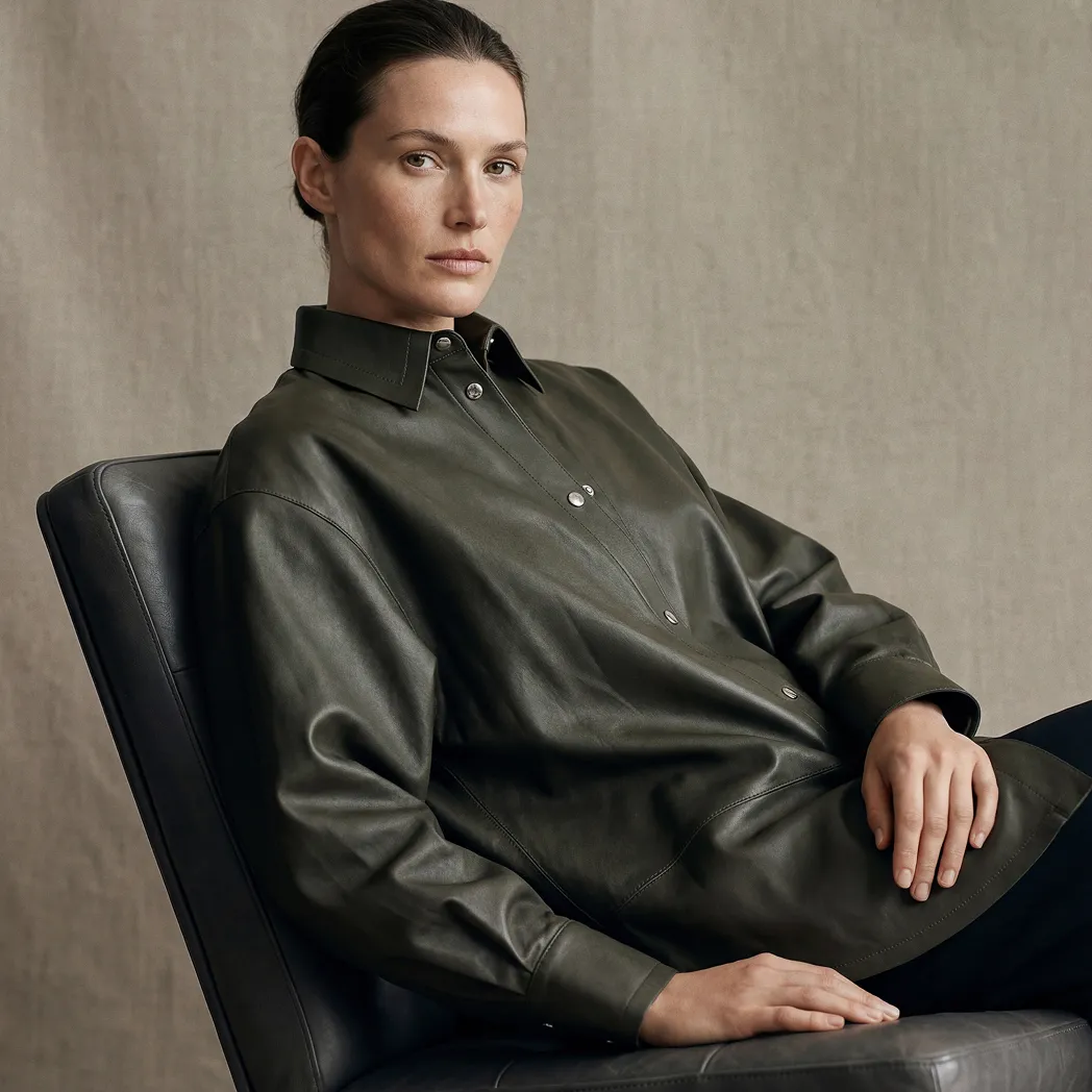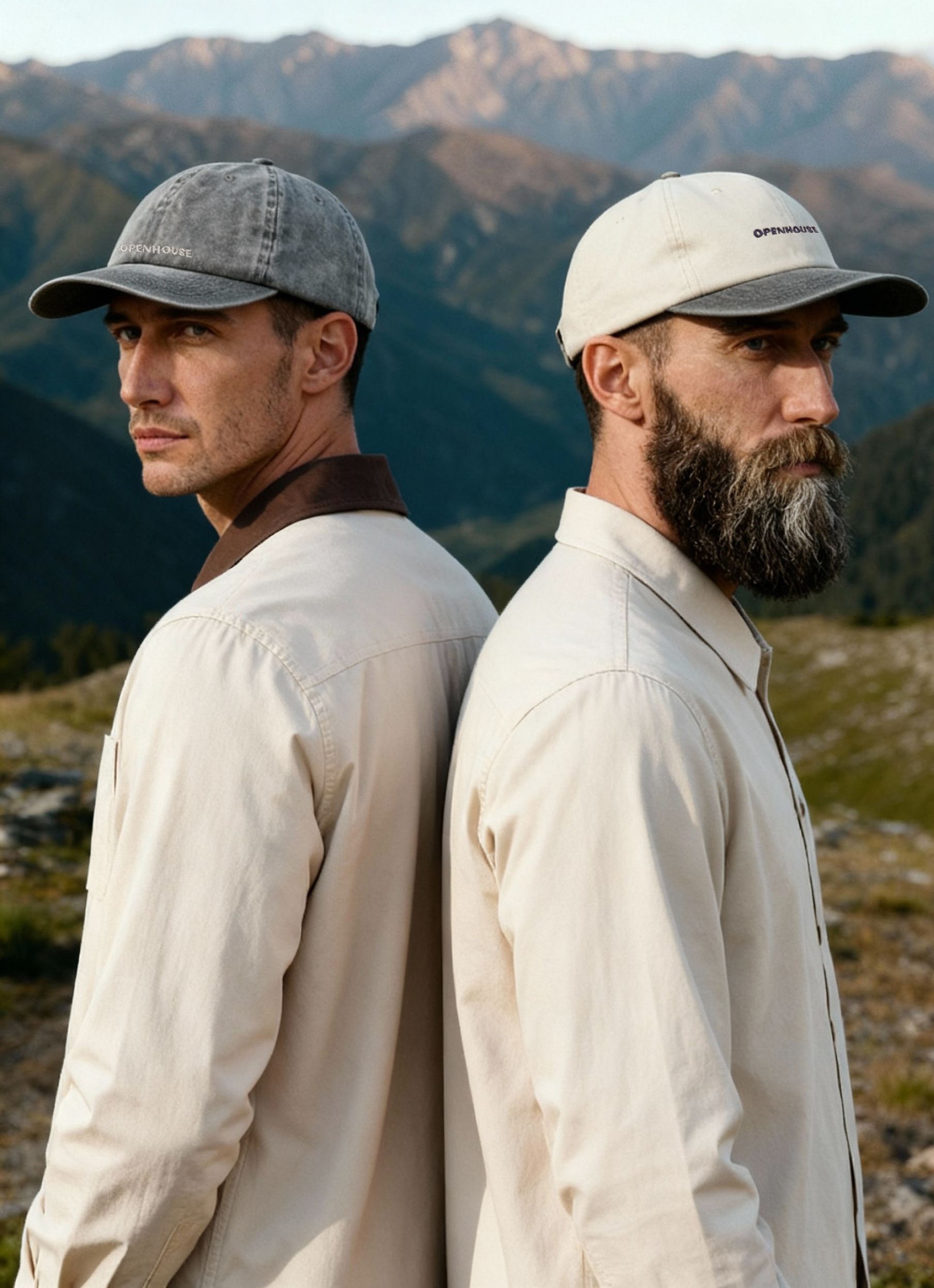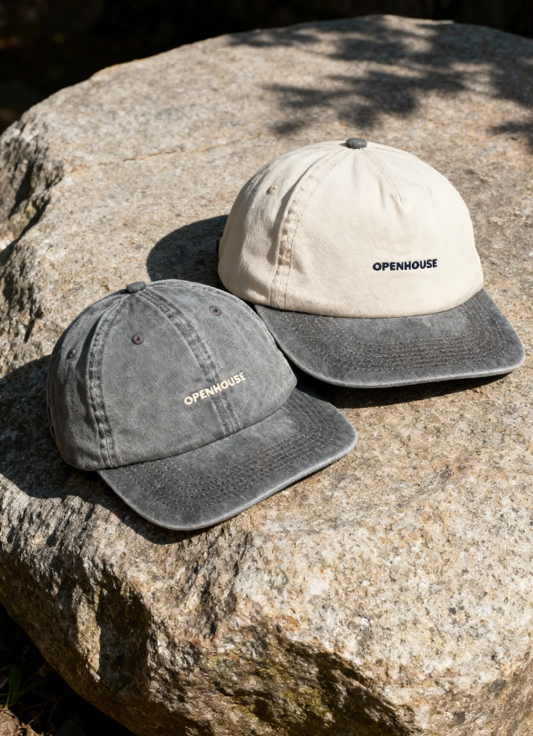

Product photography composition continues to evolve, with 2026 bringing new expectations for visual quality and creativity. As brands refine how they present their products, thoughtful composition plays an increasingly important role in helping them stand out. In this article, you’ll explore seven modern composition techniques designed to enhance visual appeal, support conversions, and align with current trends. Whether you’re refreshing your approach or fine-tuning details, these ideas can help you elevate your product photography with intention and clarity.
Why Creative Composition Matters in 2026
Product photography composition is the secret sauce behind images that make people stop scrolling and actually click. Why? Because it shapes how consumers perceive your product and brand at a glance.
Visual storytelling, achieved through creative product photography composition, helps brands stand out. A unique layout can make your product memorable, increasing recall and differentiation in a crowded digital space. As consumers crave more immersive, scroll-stopping imagery, mastering composition is no longer optional — it is essential for conversion.
Trends Shaping Product Photography Composition in 2026
The world of product photography composition is evolving fast. In 2026, AR integration and interactive 3D visuals are setting new standards, letting shoppers experience products from every angle. Cinematic product scenes — think dramatic lighting and storytelling backdrops — are also trending.
Adapting your product photography composition to these trends ensures your visuals remain relevant and effective.
Key Challenges Faced by Brands and Photographers
Brands and photographers face a balancing act with product photography composition. Creative freedom is exciting, but it has to align with brand consistency. Stray too far, and your visuals may lose their signature look. Platform-specific requirements add another layer — different aspect ratios or negative space for text overlays can complicate things.
Production costs are another challenge. Experimenting with advanced product photography composition can seem expensive, but maintaining originality is crucial. Smart planning and digital tools can help manage these hurdles without sacrificing creativity or quality.
The Opportunity: Leveraging Advanced Composition for ROI
Using innovative product photography composition is a cost-effective way to stand out in a saturated market.
Advanced composition techniques do not just look good — they drive real business results. By experimenting with new layouts, you position your brand as a trendsetter, capturing attention and encouraging shoppers to take action.
7 Creative Product Photography Composition Ideas for 2026
Looking to make your product photography composition stand out in 2026? You’re in the right place. Below, discover seven actionable ideas that will transform your images from basic to scroll-stopping. Each technique is backed by real-world examples, data, and pro tips to help you master the art of modern product photography composition.
1. Dynamic Diagonal Layouts for Visual Energy
Diagonal lines inject instant movement and excitement into product photography composition. Unlike straight or grid-based layouts, diagonals guide the viewer’s eyes across the frame, making your products feel energetic and alive.
Why do diagonals matter? Psychologically, they break monotony and suggest action, which boosts engagement. Imagine a set of makeup brushes arranged in a sweeping diagonal, or a smartphone staged so it points from one corner to the other. These layouts catch attention faster than static lines.
How to use dynamic diagonals:
- Place products, props, or shadows at an angle rather than flat.
- Use backgrounds with diagonal patterns or lines.
- Try shooting from an angle to exaggerate the effect.


Examples:
- Cosmetics are lined up from the bottom left to the top right, creating a sense of upward motion.
- Laptops or tablets angled diagonally on a desk, suggesting movement or workflow.
Pro tips:
- Diagonal layouts work especially well for social ads, particularly in vertical formats (like Instagram Stories) where the eye naturally moves from bottom to top.
- In horizontal banners, use diagonals to lead viewers toward important CTAs.
Watch out for:
- Overcrowding the frame with too many elements, which can confuse the viewer.
- Letting the diagonal overpower the actual product focus.
Experiment with diagonals to add energy and guide your audience’s attention exactly where you want it.
2. Multi-Level Depth and Layering for Immersive Scenes
Flat, one-dimensional images are out in 2026. Multi-level depth is the secret to immersive product photography composition that feels real and tactile. By introducing foreground, midground, and background elements, you build a scene that invites viewers in.
What is multi-plane composition?
- Foreground: The main product or hero item.
- Midground: Supporting props or textures.
- Background: Environmental context or storytelling elements.
How to create depth:
- Use podiums or risers to vary product heights.
- Add environmental props (plants, books, lifestyle items) behind or in front of the product.
- Adjust lighting and aperture (try a wider aperture for background blur) to visually separate each plane.
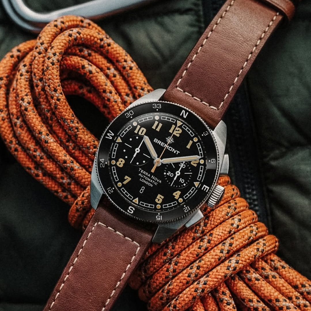
Example: The watch is placed on a surface of rope, leather, or fabric rather than a plain surface. These layers create depth and make the product feel real, tactile, and connected to a specific lifestyle rather than isolated.
Tips for success:
- Always provide a clear scale reference, especially for smaller products.
- Use Portrait mode or longer focal lengths for crisp separation.
Common pitfalls:
- Flat images with no sense of scale or context.
- Overcomplicating the background steals focus from the product.
With thoughtful layering, your product photography composition becomes more than a picture — it becomes an experience.
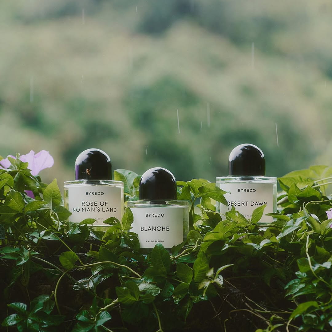
3. Rule of Odds for Organic Groupings
Odd numbers are your friend in product photography composition. The rule of odds says that groups of three, five, or seven feel more natural and visually engaging than even-numbered clusters.
Why does this work? Odd groupings disrupt symmetry, forcing the eye to move around the frame. This keeps viewers engaged and makes your arrangements feel less staged.
How to apply:
- Arrange products in trios for banners or flat lays.
- Use five or seven for playful, dynamic catalog shots.
- Mix heights and angles to avoid a rigid look.
Example: A group of fragrance bottles is styled on a soft fabric surface, with gentle folds creating natural layers around the products. The composition adds depth without distraction, making the scene feel tactile and considered while keeping the focus on the bottles themselves.
Tips:
- For added interest, stagger product heights and rotate angles slightly.
- Use even numbers deliberately to create perfect symmetry.
When to avoid: If your brand’s identity is built on order or minimalism, even numbers might be better for certain shots.
Try the rule of odds to make your product groupings feel fresh and organically arranged.
4. Triangular and Pyramid Compositions for Balance and Focus
The triangle is a timeless tool in product photography composition. Arranging products in a triangular or pyramid shape creates stability, focus, and subtle movement — all in one shot.
How do you build a triangle?
- Place your hero product at the apex (top or center).
- Arrange supporting products or props at the base.
- The viewer’s eye naturally travels up the sides to the focal point.
Example: A skincare set with the main serum elevated in the center, flanked by moisturizer and cleanser bottles, forms a clear pyramid. This draws instant attention to the hero product and supports a story of product hierarchy.
Benefits:
- Works well for hero images, banners, and social posts.
- Supports visual storytelling by highlighting your main offer.
Tip: For more inspiration, explore Skincare photography creative ideas to see how beauty brands use triangular composition to make products pop.
Cautions:
- Avoid cluttering the pyramid with too many props.
- Always maintain a clear visual hierarchy.
Triangles bring order and focus to your images, making them both attractive and effective.
5. Pattern Play and Repetition for Eye-Catching Flat Lays
Patterns and repetition are powerful tactics in product photography composition, especially for flat lays and top-down shots. When the eye spots a rhythm — be it color, shape, or product — it’s drawn in and held longer.
How to use patterns:
- Line up products in symmetrical rows or circles.
- Alternate colors or sizes for visual rhythm.
- Break the pattern strategically with one standout product to create emphasis.
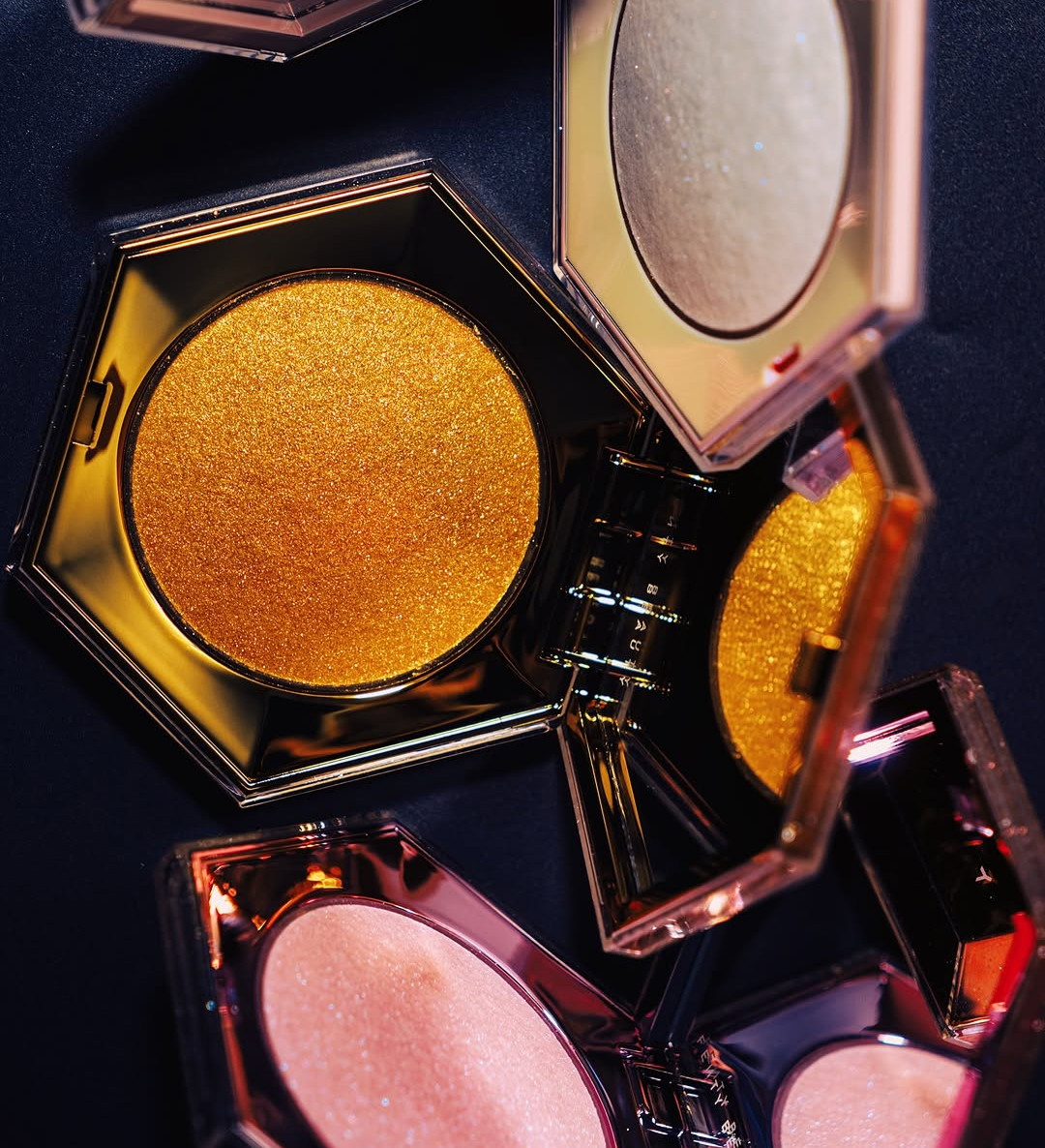
Example: Highlighters arranged in a grid, with one bold color breaking the sequence. This not only highlights the featured product but also makes the image memorable.
Best for: Products with multiple variants, like different flavors, colors, or scents.
Platform tips: Flat lays with strong patterns perform especially well on Instagram and Pinterest, where quick impact is key.
Potential pitfalls:
- Overly busy arrangements that distract from the hero product.
- Losing focus if every product looks the same.
Patterns make your product photography composition pop, but always keep your main subject in the spotlight.
6. Integrating Negative Space for Modern Minimalism
Negative space — the empty areas around your subject — is a modern essential in product photography composition. It highlights your product, creates a clean look, and leaves space for text overlays or branding.
Why use negative space?
- Draws attention directly to the product.
- Gives your visuals a premium, uncluttered feel.
- Makes room for headlines or CTAs in banners and ads.
How to master it:
- Leave ample space around the product, especially at the edges.
- Plan for cropping — consider where aspect ratios will trim your image on different platforms.
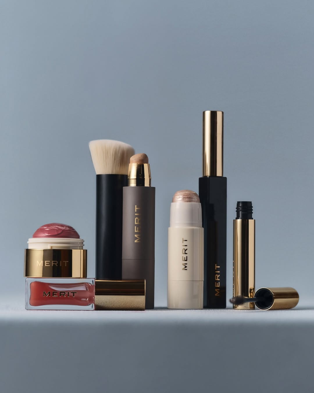
Example: The makeup products are evenly spaced across the frame, using negative space and a neutral backdrop to create a calm, uncluttered composition.
Platform advice: Negative space is crucial for email banners, Instagram Stories, and website headers, where text or logos are often overlaid.
Mistakes to avoid:
- Leaving so much empty space, the product feels lost.
- Creating off-balance images where the subject is too close to the edge.
Minimalism through negative space puts your product front and center, making it unforgettable.
7. Fibonacci Spiral and Golden Ratio for Natural Flow
The Fibonacci spiral and golden ratio are classic frameworks in product photography composition. These mathematical patterns create visuals that feel harmonious and intuitively pleasing to the eye.
How does it work?
- Overlay a spiral or golden rectangle on your scene.
- Place your hero product at the spiral’s apex.
- Arrange props, shadows, or textures along the curve for a natural flow.
When to use:
- Hero banners for high-end products.
- Artistic campaigns need a refined, balanced look.
Tips:
- Use in-camera overlays or post-production guides to precisely align elements.
- Keep the scene uncluttered to maintain the effect.
Remember: The golden ratio is a tool, not a rule. Use it to enhance, not restrict, your creative vision.
Mastering the Fibonacci spiral elevates your product photography composition to gallery-worthy status, creating images that just feel “right.”
Practical Tips for Implementing Creative Compositions
Ready to bring your product photography composition ideas to life? The right planning and execution make all the difference. Here are actionable steps to ensure your creative concepts turn into scroll-stopping visuals across every platform.
Planning Your Shoot for Maximum Impact
Great product photography composition starts before you even pick up the camera. Pre-visualize your shoot by sketching ideas or using digital overlays to map out product placement and negative space.
- Use storyboards or quick sketches to organize your concepts.
- Communicate aspect ratios, platform requirements, and intended uses with your team.
- Try digital overlays in live shooting with tools like Capture One Pro or smartphone grid apps.
This groundwork helps avoid costly reshoots and ensures every photo fits its purpose perfectly.
Adapting to Platform-Specific Needs
Not all platforms are created equal when it comes to product photography composition. Instagram Stories, website banners, and e-commerce listings each demand different aspect ratios and focal points.
- Adjust your layout for square, vertical, and landscape formats.
- Double-check that key elements and negative space remain in-frame after cropping.
- Leave space for text overlays, CTAs, and logos where needed.
Thinking ahead about these details will keep your images looking sharp and professional everywhere they appear.
Balancing Creativity with Brand Consistency
Experimenting with product photography composition is exciting, but consistency is key for brand recognition. Develop clear guidelines that allow for creative layouts while keeping your visual identity intact.
- Choose signature composition styles, like triangular hero images or minimal negative space.
- Set rules for color palettes, lighting, and prop usage.
- For more on this, see these Product photography consistency tips.
Consistent visuals help customers connect with your brand at a glance, even as you try new approaches.
Tools and Technology for Next-Level Product Photography
Today’s tech can supercharge your product photography composition. Virtual studios let you test endless arrangements before a single product is shot.
- Use 3D or virtual studios for experimenting with complex layouts.
- AI-driven tools give real-time feedback on balance, harmony, and focal points.
- Tethered shooting setups help you adjust composition on the fly during your session.
Leverage these innovations to push creative boundaries and streamline your workflow.
Common Mistakes and How to Avoid Them
Even with the best ideas, product photography composition can falter if you overlook the basics.
- Don’t overcrowd the frame or let props steal the spotlight.
- Always include a sense of scale and context to avoid confusing viewers.
- Plan for multi-platform use from the start to prevent awkward cropping.
By staying mindful of these pitfalls, your creative compositions will consistently deliver impact and clarity.
Frequently Asked Questions about Product Photography Composition in 2026
Curious about product photography composition in 2026? Here are answers to the most common questions brands and creators ask:
What are the top trends?
Expect more AR, 3D, and AI-powered visuals. For more, see 2026 Trends in AI Product Photography.
How do I pick the right style?
Match your composition to your product type and the main platform you use.
Can I use a smartphone?
Absolutely, modern phones and apps make creative composition accessible.
How do I stay creative but on-brand?
Stick to your brand’s color palette and style, but try new layouts.
Are there tools to help?
Yes, many apps offer overlays and planning features for product photography composition.
Now that you’ve got these seven fresh ideas for product photography composition in 2026, why not put them into action on your next project? Whether you’re reimagining catalog shots or looking to capture that perfect hero image, the right team can help you bring these creative visions to life.
At Squareshot, we’re all about turning bold ideas into stunning visuals with quick turnaround and expert support every step of the way.
Ready to see what your products could look like when creativity meets experience?
Product A
SQUARE SHOT