
Improving e-commerce conversion starts with visuals — specifically, how well your product is presented. High-quality photography, intuitive layout, and clear navigation influence whether a visitor becomes a customer.
If your pages are slow, cluttered, or visually inconsistent, you lose trust quickly. Every image, button, and sentence needs to serve a purpose: helping the customer decide.
Beyond layout, your checkout process must feel safe and seamless. That means fast load times, minimal friction, and mobile responsiveness. These aren’t just best practices — they’re conversion drivers.
Squareshot helps ecommerce brands meet visual expectations with catalog-ready images and consistent styling. These details support higher conversion by eliminating confusion at the most critical decision points.
In this guide, you'll learn how to fine-tune your pages, visuals, and processes to convert more visits into purchases — step by step.
Optimizing Product Pages
Your product pages need clear descriptions, sharp images, and effective calls to action to turn visitors into buyers. Each element builds trust and guides customers to make a purchase.
Writing Compelling Product Descriptions
Focus on what the customer needs to know about your product. Break your description into clear parts like wear, care, and benefits. Use simple, direct language to highlight unique features. Include a sizing guide or any details that reduce confusion. Add a “Complete the outfit” section with related items to encourage more sales. Avoid long paragraphs — short, easy sentences keep readers engaged.
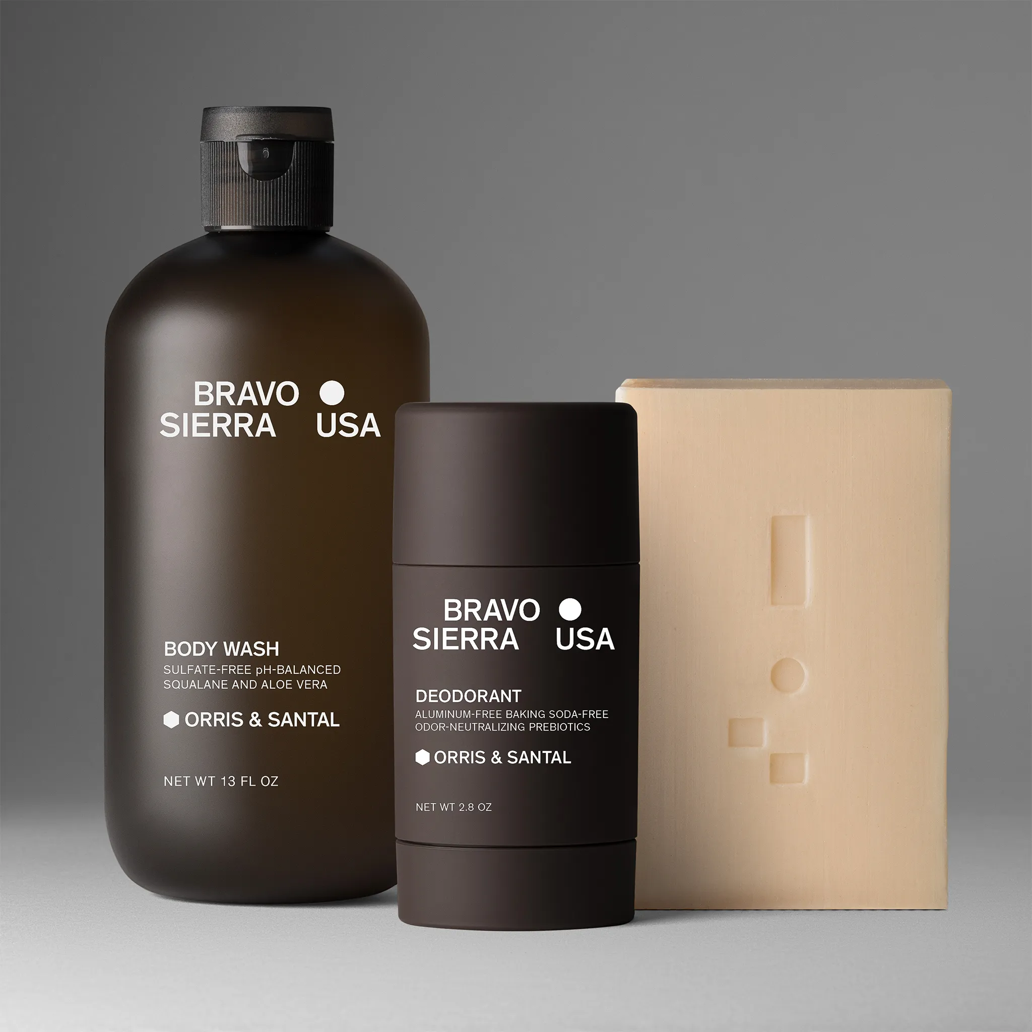
Showcasing High-Quality Images
Show multiple images from different angles and in real-life use. Clear, detailed photos build trust and help customers imagine the product in their life. Avoid over-editing to prevent false expectations. Use consistent lighting and style to keep your catalog professional.


A good photo shoot plan saves time and creates images that fit your brand. Offer both studio and real-life shots to improve conversion rates.
Utilizing Persuasive Call-to-Action Buttons
Make your call-to-action (CTA) buttons prominent and clear. Use action words like Buy Now, Add to Cart, or View Details. Choose button colors that contrast with the page but stay on-brand. Place CTAs near the price, below the description, or next to product options. Make sure buttons work well on mobile devices. Clear CTAs reduce hesitation and help customers move smoothly through checkout.
Streamlining User Experience
Your website needs to be simple and fast so visitors can find what they want easily. Clear menus, smooth mobile use, and quick loading times keep shoppers focused and ready to buy.
Improving Website Navigation
Design your site’s menu to be easy to scan and use. Use clear categories and subcategories that match your products. Limit menu options to no more than seven main links to avoid clutter. Include a search bar on every page, usually at the top right.
Use filters and sorting tools on product pages so customers can narrow down choices by price, size, color, or rating. Simple navigation reduces frustration and helps visitors quickly reach product pages or checkout.
Enhancing Mobile Responsiveness
Your site must look and work well on smartphones and tablets. A mobile-optimized design adjusts text size, images, and buttons for smaller screens. Make touch targets like buttons and links large enough to tap easily. Avoid elements that need zooming or horizontal scrolling. Menus should collapse into drop-down icons for cleaner viewing. Fast, smooth mobile browsing keeps customers engaged and decreases bounce rates.
Reducing Page Load Times
Fast load speed keeps visitors on your site. Aim for pages to load within 3 seconds or less by optimizing images and limiting heavy scripts. Use compressed images that keep quality but reduce file size. Remove unnecessary plugins or scripts that slow your site.
Consider a content delivery network (CDN) to serve your pages faster based on user location. Faster load times increase conversion chances because shoppers can see products without delay.
Building Trust and Credibility
Trust helps visitors feel confident in your store. Show clear proof of product quality, secure payment methods, and transparent policies to make customers more likely to buy.
Displaying Customer Reviews and Testimonials
Customer reviews give your store real proof of quality. Show star ratings, written feedback, and photos from buyers so visitors see honest opinions. Highlight both positive and helpful critical reviews. Use a clear, easy-to-read format with short quotes, ratings, and user images. Display reviews near product descriptions for easy access. This helps shoppers trust your products and can lower return rates.
Highlighting Secure Checkout Processes
Make your checkout feel safe and simple. Show security badges like SSL certificates and accepted payment logos to reassure customers. Keep checkout steps minimal and clear. Briefly explain your data protection steps, such as encrypted transactions and no sharing of personal information.
Adding a progress bar helps users know where they are. When customers trust your checkout, fewer carts are abandoned.
Establishing Clear Return Policies
A clear, fair return policy reduces hesitation. Write your policy using simple language and list key points like return deadlines, conditions, and refund methods in bullet form. Make the policy easy to find from the product page and checkout. Offer free or low-cost returns to boost confidence.
When customers know they can return products without hassle, they’re more likely to finalize the purchase.
Simplifying the Checkout Process
Make checkout easy so your customers finish buying without frustration. Clear steps and fewer obstacles keep people from abandoning their carts.
Cart abandonment remains one of the biggest barriers to e-commerce conversion. According to Baymard Institute, the average global abandonment rate is 70.19%. It’s often caused by avoidable UX issues like complicated checkout forms or hidden costs. Simplifying this step can directly improve your store’s performance.
Minimizing Form Fields
Ask only for essential information during checkout. Long forms make customers pause or leave. Focus on data like name, shipping address, and payment details only. Use simple layouts with clear labels. Avoid extra fields unless absolutely needed. Use auto-fill options to speed up the process. Allow customers to save their info securely for future visits. Reducing form steps lowers errors and speeds up orders.
Offering Multiple Payment Options
Give your customers a choice of how to pay. Include common methods like credit cards, PayPal, and digital wallets such as Apple Pay or Google Pay. Some buyers prefer buy-now-pay-later services or gift cards. Providing several payment options removes barriers. Shoppers are more likely to finish their purchase if they find their favorite or most trusted method. Keep payment buttons clearly visible and easy to select.
Providing Guest Checkout
Not everyone wants to create an account before buying. Offer a guest checkout option so customers can buy without signing up. This speeds up their process and cuts down on hesitation. Invite guests to register after purchase, but don’t require it. This approach keeps the experience quick and focused on finishing the sale.
Personalizing Shopping Experiences
Make your online store feel tailored to each shopper to boost sales and keep customers coming back. Show relevant products and adapt to shopper actions for a smoother and more engaging shopping journey.
Recommending Related Products
When someone views or buys an item, suggest products that match or complement it. For example, if a customer looks at a jacket, recommend scarves or gloves that go with it.
Use clear placement like “Customers also bought” or “Complete the look” sections on product pages or at checkout. Make recommendations based on actual purchase data or browsing history.
Keep suggestions easy to scroll and visually aligned with your product images. This helps customers discover items they might not have searched for directly.
Utilizing Behavioral Targeting
Track customer behavior like clicks, searches, and time spent on pages to tailor what they see next. For example, if a visitor frequently checks out running shoes, show promotions or new arrivals in that category.
Use cookies or user accounts to remember past activity and personalize homepage banners, emails, or ads. Make suggestions and update in real time as shoppers explore your site.
Dynamic content that changes based on behavior improves relevance and encourages more purchases.
Implementing Conversion Optimization Strategies
To boost your ecommerce conversion, test different web page elements and use targeted messages to keep visitors engaged. Small changes can improve your buyer’s experience and encourage more sales.
A/B Testing Pages and Elements
A/B testing compares two versions of a page or element to see which works better. Test headlines, images, buttons, or product descriptions. Try different button colors or text like “Buy Now” vs. “Add to Cart.” Run your test with a portion of your traffic and track which version gets more clicks or purchases.
Use clear data to decide which changes to keep. Change just one element at a time to understand what really affects conversion. You can also test product images or layouts. If you use multiple photos, see if showing a model wearing the product lifts sales more than plain shots.
Using Exit-Intent Popups
Exit-intent popups appear when a visitor moves their cursor to leave your site. These messages give you one last chance to keep them or collect their contact info. Offer discounts, free shipping, or remind them about items left in their cart. Keep your message short and clear.
For example:
- “Wait! Get 10% off if you stay.”
- “Leaving so soon? Save your cart and get free shipping.”
Make sure popups are easy to close and don’t interrupt the shopping flow too much. Use them only when visitors show intent to exit.
Leveraging Retargeting and Email Marketing
Use targeted ads and well-planned emails to boost your e-commerce conversion. Retargeting brings back visitors who left without buying, while emails keep your customers engaged and encourage repeat sales.
Recovering Abandoned Carts
Many shoppers add items to their carts but leave before finishing the purchase. Send timely emails reminding customers about their carts. Include product images, prices, and a strong call to action. Offer incentives like discounts or free shipping to encourage checkout.
Keep the message simple and focused on action. Combine this with remarketing ads that show the same or related products to increase your chances of turning those visitors into buyers.
Segmenting Email Campaigns
Customize your emails based on customer behavior or purchase history. Send different messages to first-time buyers, repeat customers, and those who showed interest but never bought. Segmented emails perform better because they feel more personal and relevant. Use data like past purchases, browsing habits, or location to create groups.
Tailor your offers, product recommendations, and content to match what each segment wants.
Analyzing Performance and Making Continuous Improvements
Study how your ecommerce site performs and adjust based on what you find. Pay attention to key data to spot problems and areas that can boost sales. Tracking conversion rates over time shows if your changes are working.
Interpreting Analytics Data
Look at specific numbers like page views, bounce rates, and where visitors drop off. Focus on which pages get the most traffic but have low conversion. This often points to issues like unclear product descriptions or slow loading times. Use tools like Google Analytics to track how customers move through your site.
Watch for trends, such as which traffic sources bring the most buyers. Break down data by device type, location, and time to learn more about your audience. Create reports regularly to compare results. Highlight metrics like cart abandonment and checkout completion to find small problems before they hurt sales.
Monitoring Conversion Rates Over Time
Conversion rates show the percentage of visitors who buy after arriving on your site. Track this metric daily or weekly to see if your updates help or hurt sales. When rates drop, look back at recent changes, such as new photos, checkout processes, or pricing. Test one change at a time to see what makes a difference.
Use A/B testing to compare two versions of a page. This helps you choose the better design faster. Keep notes on what works best for different product categories. By consistently monitoring and testing, you ensure your ecommerce site evolves based on real results.
Improving Your Ecommerce Funnel Through Precision
Improving ecommerce conversion isn’t just about having good photos — it’s about removing friction, guiding attention, and reinforcing trust at every touchpoint. The product page, checkout process, and follow-up tactics must all work together to support a confident buying decision.
Detailed images, simplified forms, and relevant CTAs create a clear path for your customer. Pair that with behavioral personalization and well-timed email campaigns, and you start building a reliable system for sales growth.
Squareshot helps brands maintain visual consistency with fixed per-image pricing. We also provide catalog-ready deliverables, so product photography is one less bottleneck in your optimization efforts.
If your brand is ready to close more sales with less friction, start streamlining your ecommerce visuals and experience today.
Frequently Asked Questions
Effective ecommerce conversion relies on measuring key performance indicators and optimizing product images. You can improve your sales funnel by refining your website, marketing, and customer experience.
What are effective strategies for conversion rate optimization in online retail?
Use clear product images that highlight important details. Keep your styling consistent. Track how visitors move through your sales funnel to find where they drop off. Test different call-to-action buttons and page layouts to see what encourages buying.
Can you suggest tactics to boost my Shopify store's conversion rate?
Make sure your product photos are high quality and show products from multiple angles. Simplify the checkout process. Add trust signals like reviews and guarantees. Use targeted ads with strong offers and clear calls to action.
What methods can I use to enhance conversions on my website?
Improve site speed and navigation to keep visitors interested. Use clear and concise product descriptions. Offer free shipping or easy returns to reduce purchase barriers. Show social proof such as customer testimonials and ratings.
How can digital marketing contribute to higher conversion rates?
Target your digital ads well and use clear calls to action. Retarget visitors who left without buying. Update your visual content regularly to stay fresh and relevant. Track metrics to improve future campaigns.
What benchmarks indicate a healthy conversion rate for an e-commerce business?
Conversion rates usually range from 1% to 3%, depending on the industry. Rates above 3% are strong for many online stores. Monitor your data regularly to compare against your past performance and similar competitors.
What changes can I make to improve my shop's conversion performance?
Improve your product photography with clean, catalog-ready images. Streamline your website’s layout and checkout steps. Offer promotions and loyalty rewards to encourage repeat customers. Test and adjust your marketing messages and visuals regularly.

Product A
SQUARE SHOT