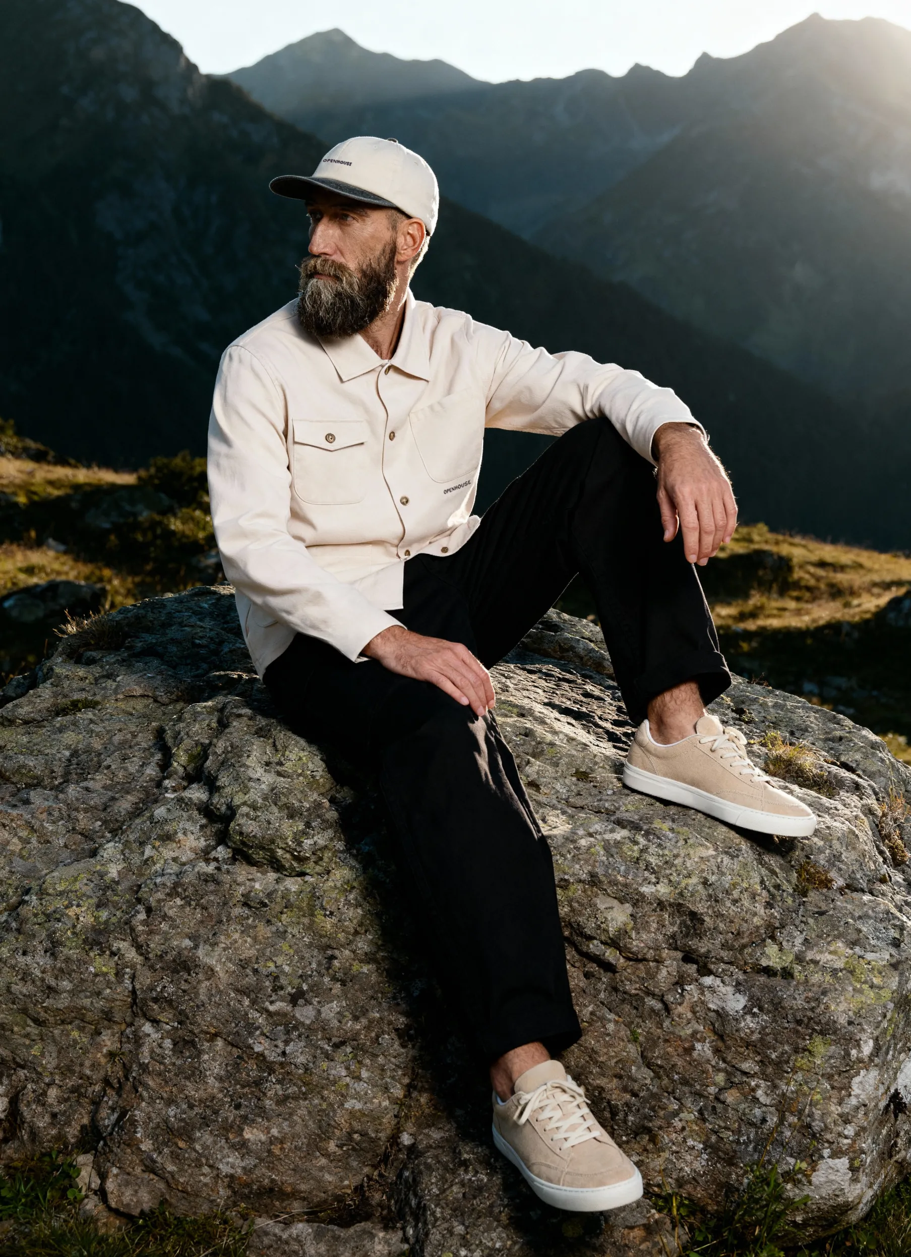

Monochromatic product photography is shaping the look of leading brands in 2026. If you want your products to stand out in today’s crowded digital space, mastering this eye-catching trend is worth trying.
In this guide, you’ll discover why monochromatic color schemes drive engagement, how to plan and style a cohesive shoot, and the technical steps for flawless results. We’ll break down editing secrets, explore the latest trends, and share expert advice so you can elevate every shot.
Ready to transform your product visuals and captivate your audience? Let’s dive in.
Understanding Monochromatic Product Photography
Monochromatic product photography continues to play an important role in visual branding in 2026. As brands seek clear, consistent ways to present their products, understanding this approach can help create cohesive, recognizable imagery. Let’s take a closer look at its core principles and why it remains relevant today.
The Fundamentals of Monochromatic Color Schemes
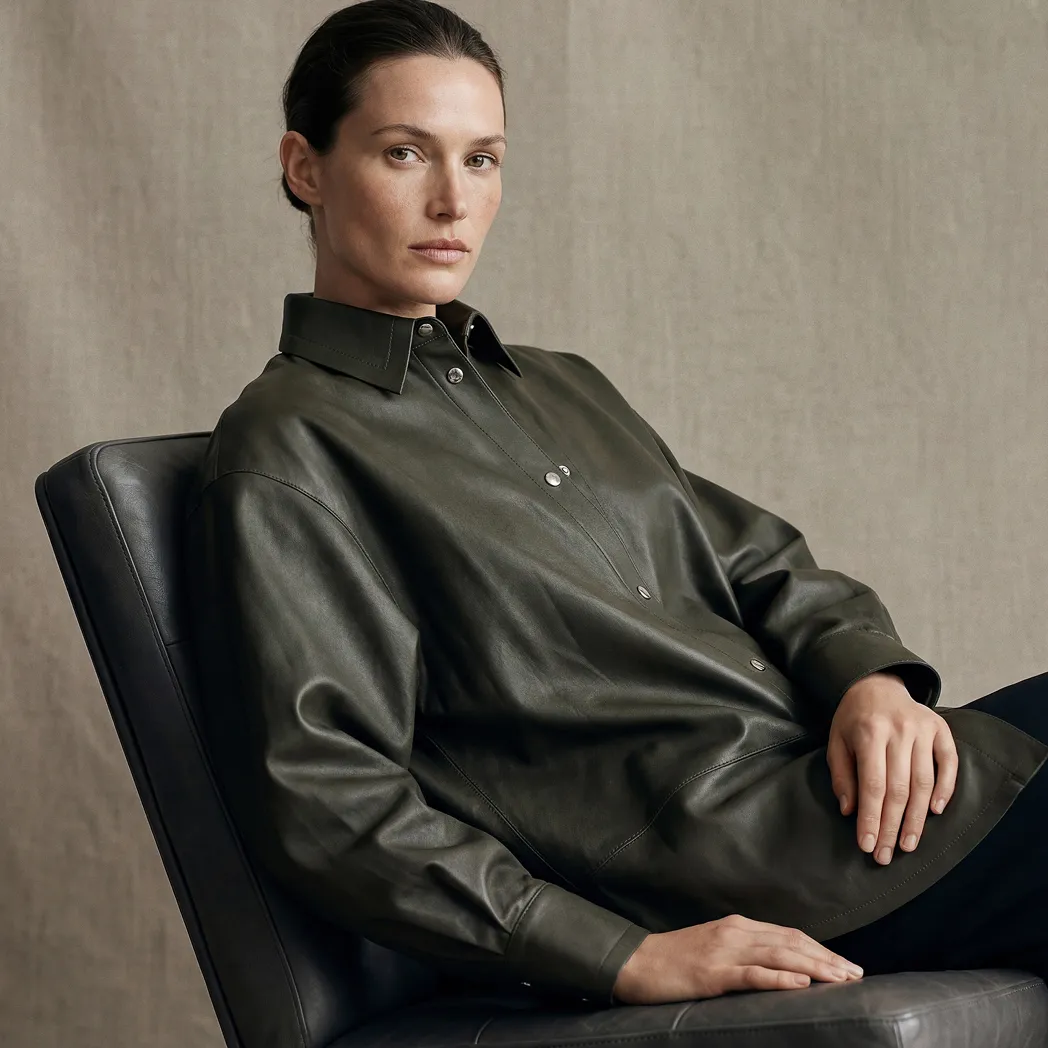
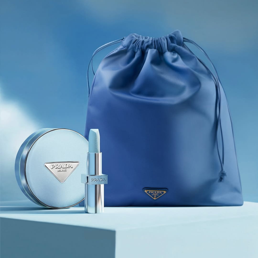
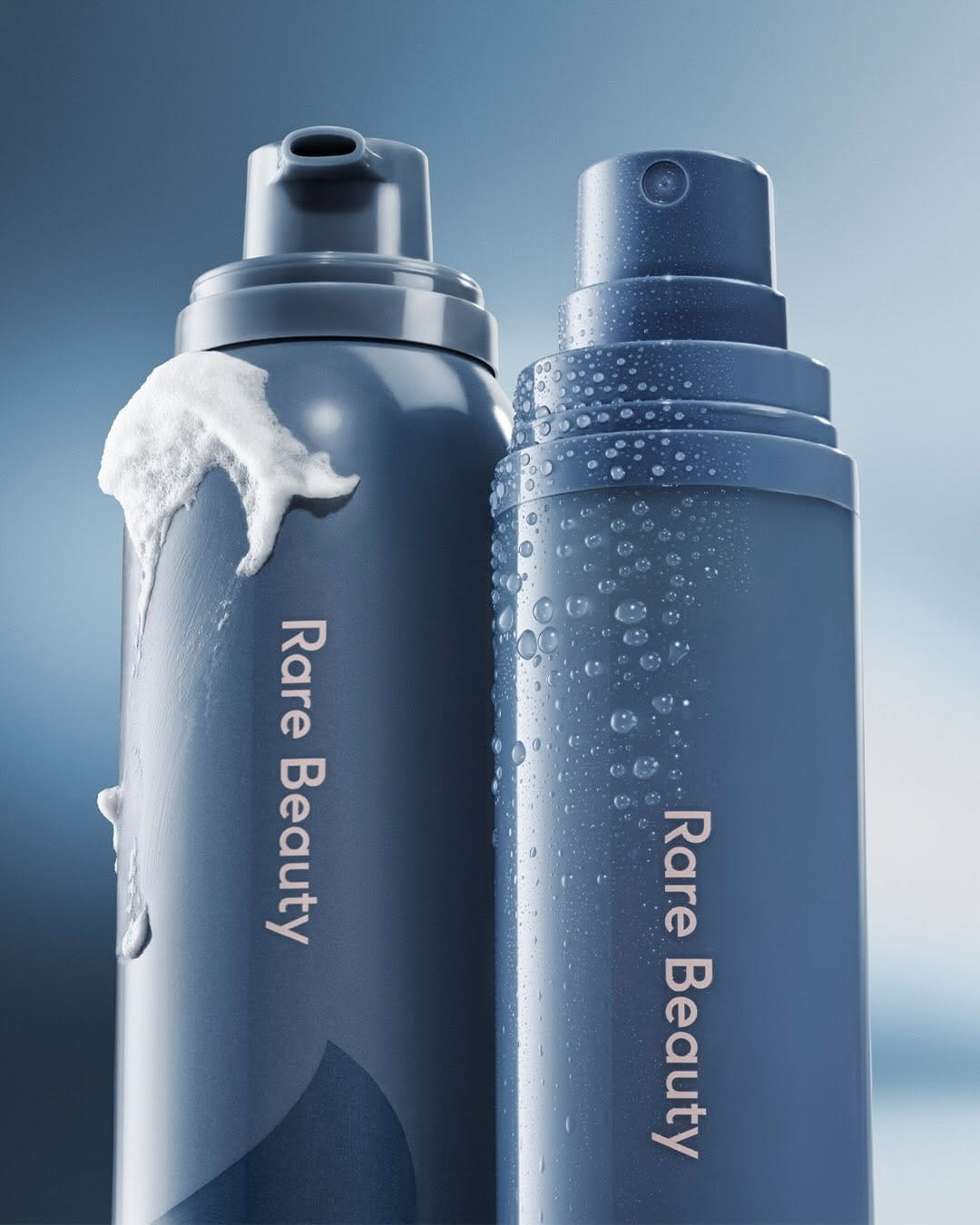
At its core, monochromatic product photography uses just one base hue, exploring its full spectrum by mixing tints, tones, and shades. This creates a harmonious look in which every visual element feels connected. Unlike minimalist photography, which often relies on neutral complementary colors and stark simplicity, monochromatic product photography celebrates color in all its depth, subtlety, and emotional weight.
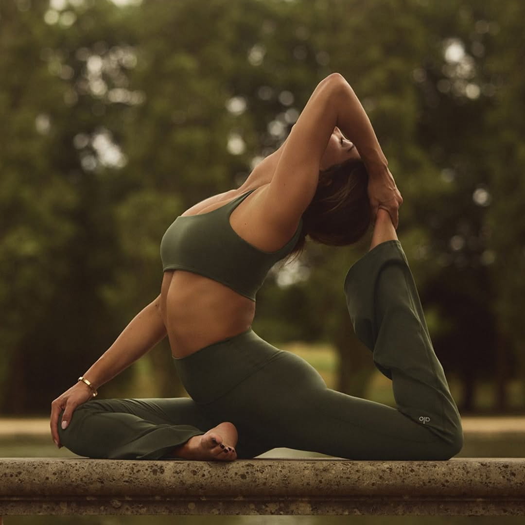
Color psychology plays a vital role here. A single color palette can evoke powerful feelings and reinforce brand identity. For example, using pink in monochromatic product photography can signal playfulness or creativity, while green might suggest freshness or eco-consciousness. Every color choice delivers a message, turning product images into mood-driven brand statements.
Monochromatic product photography brings visual cohesion. When every prop, background, and product detail shares the same color family, the viewer's eye focuses right where you want it — on the product itself. This unity is why so many top campaigns in beauty, tech, and apparel have embraced the look. Consider iconic campaigns where brands enveloped products in a sea of matching color, creating unforgettable, scroll-stopping visuals.


The numbers back up the trend. According to the Creative Trends 2026 Report, monochromatic colour scheme has surged in product photography, with brands seeing higher engagement and improved recall rates. This style is often confused with duotone, but duotone uses two contrasting hues, while monochromatic product photography stays loyal to one color for maximum emotional impact.
A common misconception is that monochrome means boring. In reality, monochromatic product photography is incredibly versatile. By layering different textures — matte, glossy, soft, or hard — you introduce depth and dimension without breaking the color spell. On social media platforms like Instagram and Pinterest, these unified palettes consistently outperform multicolor images, capturing more likes and shares.
Why Monochromatic Photography Works for Products
Monochromatic product photography stands out in crowded feeds. When users scroll through endless multicolored images, a bold, unified palette immediately grabs their attention. This standout factor is why more brands are switching to this style for launches and campaigns.
Color dominance helps reinforce brand association. If a brand always uses a signature color in their monochromatic product photography, customers start to recognize and trust the brand faster. Consistency in color builds familiarity and boosts brand loyalty.
The simplicity of monochromatic product photography also lets product details shine. Without competing colors, textures, and shapes become more noticeable. This clarity supports storytelling, letting brands link product mood directly to color psychology. For example, a monochromatic wellness shoot built around earthy greens
Monochromatic product photography is more than a trend — it’s a proven way to cut through the visual noise, define your brand, and drive real results.
Planning and Styling a Monochromatic Shoot
Creating an unforgettable monochromatic product photography shoot starts long before you pick up your camera. Thoughtful planning, styling, and technical decisions will set your visuals apart in 2026’s crowded digital photography landscape.
Let’s break down the key steps — color selection, set styling, and lighting — to help you craft product images that are both cohesive and captivating.
Choosing the Right Color for Your Product
Color choice is the heartbeat of monochromatic product photography. Start by aligning your selected hue with your brand’s core values and the emotions you want to evoke. For example, a wellness brand might gravitate toward green for a sense of renewal.
Consider your audience demographics and psychographics. What colors resonate with their expectations and cultural backgrounds? Analyze competitor campaigns to find gaps and opportunities for differentiation within monochromatic product photography.
Test color options using digital mood boards and palette previews. These tools help visualize how different tints, tones, and shades of your chosen hue interact with your product. Always factor in color accessibility — use online simulators to ensure your visuals are inclusive for color-blind users.
Checklist for Color Selection:
- Align with brand identity and messaging.
- Analyze competitor color use for uniqueness.
- Test with mood boards and digital previews.
- Prioritize accessibility for all viewers.
For instance, a beauty brand might choose a monochromatic blue palette to convey calm and reliability, reinforcing trust with every visual.
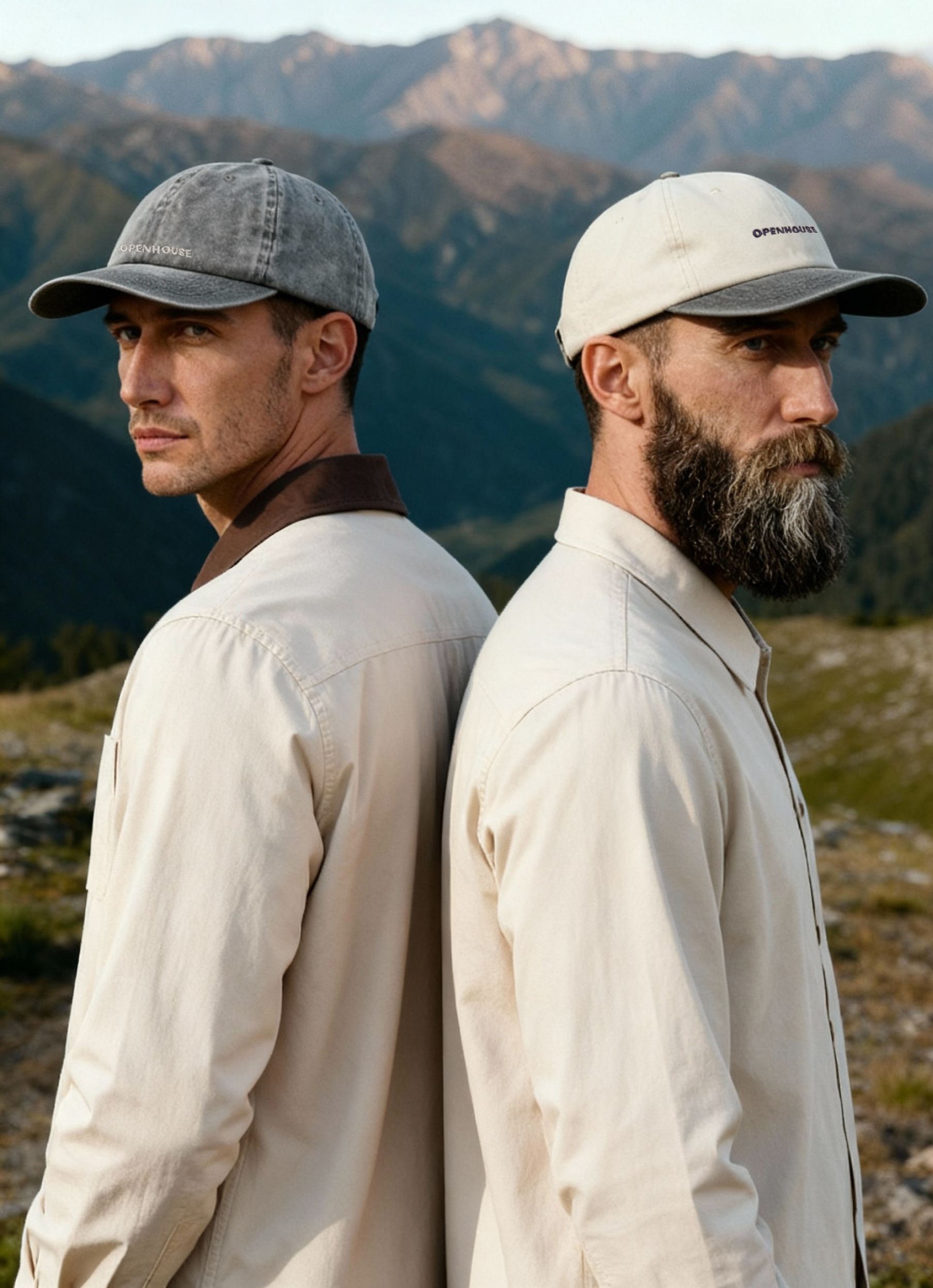
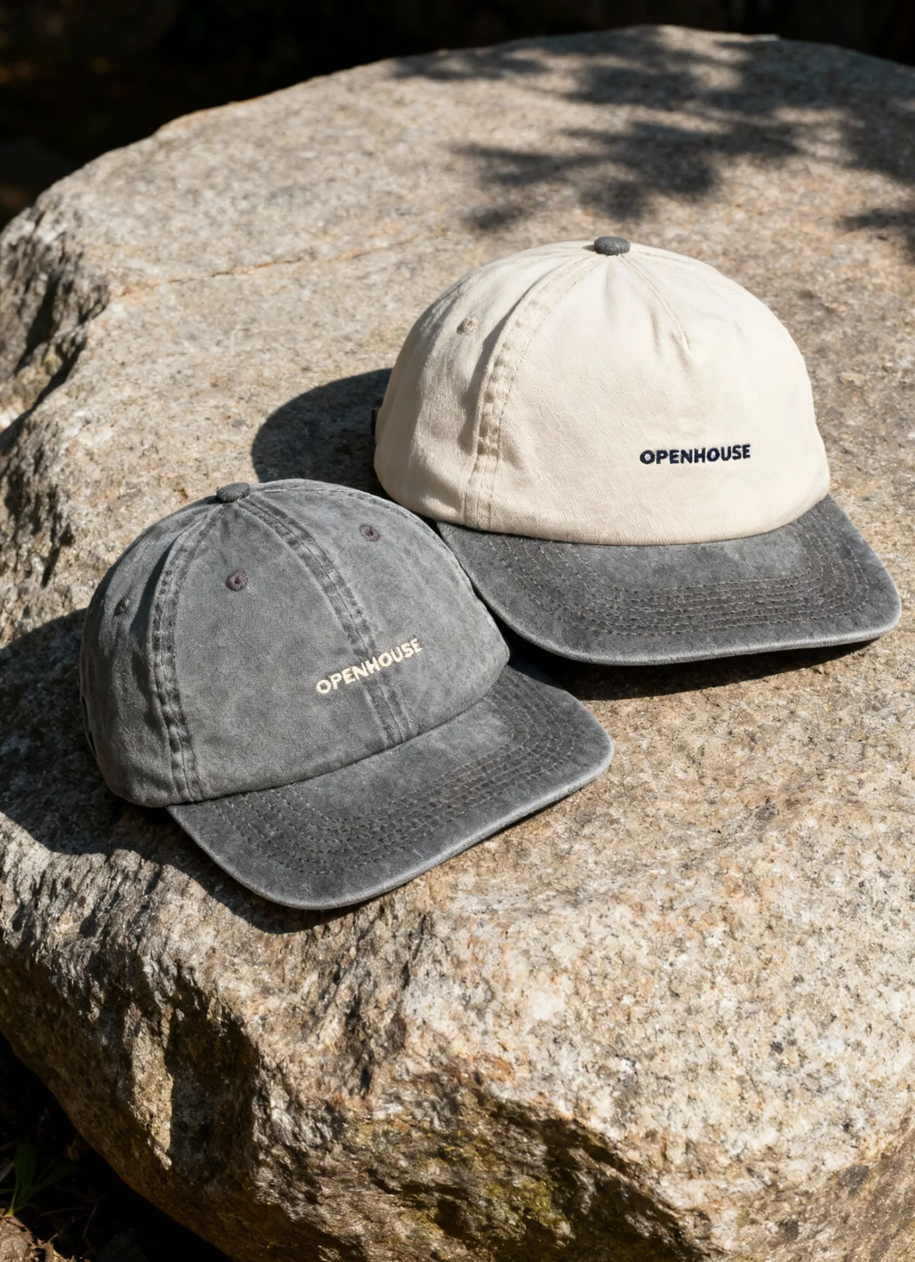
Props, Backgrounds, and Textures
The secret to stunning monochromatic product photography lies in your supporting elements. Sourcing props, backgrounds, and even small accents in matching or complementary tints will amplify your chosen color and keep the focus on your product.
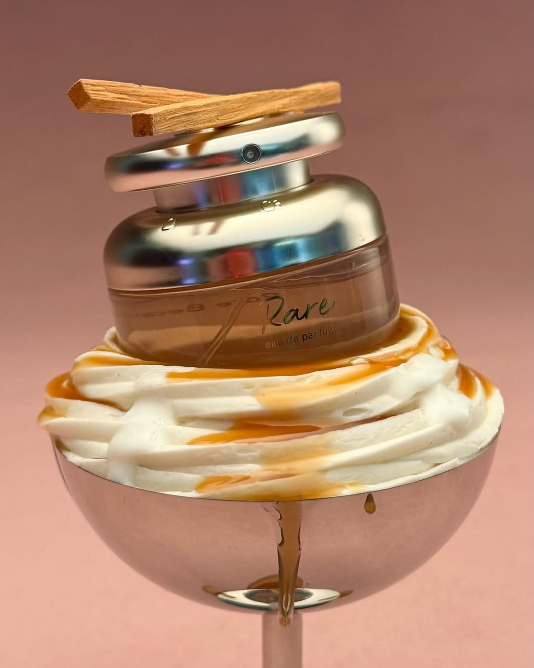
Layer different shades and textures for depth without breaking the monochrome effect. Matte surfaces can create a soft, understated look, while glossy or metallic props introduce energy and light play. Consider how hard versus soft textures impact perception — hard surfaces feel modern and bold, while soft textiles suggest comfort and warmth.
Tips for Perfect Monochrome Styling:
- Source props in multiple tints and finishes of the chosen color.
- Use paper, fabric, or painted surfaces for backgrounds.
- Layer textures for visual interest, but avoid anything that distracts from the main hue.
- Check for color contamination from stray items or mixed materials.
Minimalist setups use just a few well-chosen props, while elaborate scenes can immerse the product in a unified color world. For more inspiration and creative tips, check out these creative product photography ideas.
Lighting Considerations for Monochrome
Lighting can make or break a monochromatic product photography shoot. Your goal is to enhance the color, not distort it. Start by controlling light temperature — use daylight-balanced bulbs or gels to maintain color accuracy and avoid unwanted shifts.
Softboxes and reflectors help you shape the light, creating even illumination or dramatic shadows as needed. Experiment with high-key lighting for a bright, airy effect, or low-key lighting for moodier, more intense visuals. The right choice will depend on your product’s personality and the story you want to tell.
Steps for Flawless Lighting:
- Set your white balance to match the color temperature of your lights.
- Use softboxes for diffused light and smooth shadows.
- Add gels to lights if you need to enhance or deepen your monochrome effect.
- Watch for shadows and highlights that might introduce new colors or wash out details.
Whether you’re shooting high-key or low-key, always monitor your scene for color purity and consistency.
Step-by-Step Shooting Process for Monochromatic Product Photography
Creating standout visuals with monochromatic product photography is all about precision and planning. This step-by-step process will guide you from pre-shoot setup to capturing the perfect shot, ensuring your images stay true to your vision and brand.
Pre-Shoot Preparation
The foundation of successful monochromatic product photography lies in meticulous pre-shoot planning. Start by assembling a set where every detail matches your chosen hue. Gather props, backgrounds, and even product variants in the same color family. Paint, fabric, colored acrylic, or printed paper can help you achieve seamless color harmony.
Camera settings are crucial. Adjust your white balance to suit the dominant color and avoid unwanted tones. Use a custom white balance card, if possible, for greater accuracy. Always shoot in RAW format, as it gives you the most flexibility in post-production and helps preserve color fidelity.
Before the main shoot, take test shots and review them on a calibrated monitor. Look for any color inconsistencies or reflections that might break the monochromatic illusion. Create a checklist to ensure every item fits the palette, from the product itself to the smallest prop.
Lighting is another essential factor. Consistent, controlled lighting prevents color drift and maintains purity across the scene. For more technical advice on backgrounds and lighting, check out this white background studio guide, which offers tips especially relevant to monochromatic product photography.
Meticulous preparation minimizes surprises and sets the stage for a smooth, creative session.
Composition and Framing Techniques
Composition is where monochromatic product photography truly shines, letting you highlight the product’s features and color. Use the rule of thirds to balance your shot or symmetry for a bold, graphic effect. Monochrome palettes naturally emphasize form and texture, so thoughtful framing is essential.
Negative space is your friend. By allowing areas of the frame to remain uncluttered, you draw attention to your product and reinforce the dominance of your chosen color. Depth of field can isolate the product from the background or integrate it, depending on your creative direction. For a flat lay, keep everything on the same plane and ensure props align with your color theme. For upright compositions, pay attention to background gradients and how light falls on surfaces.
During this stage, continually assess whether your composition supports the story you want to tell. Monochromatic product photography allows you to simplify or dramatize, depending on your brand’s personality and the product’s unique qualities.
Capturing the Shot
Now it’s time to bring your monochromatic photography vision to life. Begin with real-time adjustments: tweak the placement of props, shift your lighting setup, and experiment with camera angles until every element feels cohesive. Use tethered shooting to monitor images on a larger screen, which helps catch color inconsistencies or distractions before they become issues.
Color consistency is key. Watch out for reflections from colored objects or surfaces, as these can introduce unwanted hues and break the monochrome effect. If you notice a problem, adjust your lighting or swap out props to maintain purity. Managing shadows and highlights is also essential — too much contrast can wash out or oversaturate your chosen color, while too little can flatten the image.
Troubleshooting is part of every shoot. If you spot glare, try repositioning your studio lights or using diffusers. To reduce unwanted shadows, add reflectors or adjust your main light. Here’s a quick troubleshooting checklist:
- Glare on reflective surfaces? Use diffusers or change the angle.
- Unwanted color casts? Remove or cover reflective objects in the environment.
- Shadows too harsh? Add a fill light or use a larger softbox.
Finally, document your workflow with behind-the-scenes shots. These not only help with process improvement but also serve as engaging content for your brand’s social channels. Monochromatic product photography is as much about the journey as the final image, so enjoy experimenting and refining your process.
Post-Production and Editing for Monochromatic Perfection
Perfecting your monochromatic product photography doesn't end when you put your camera down. The magic truly happens in post-production, where careful editing transforms a good shot into a showstopper.
Let’s break down the essential editing steps, so your visuals pop with unity and color precision.
Color Correction and Enhancement
The first step in editing monochromatic product photography is achieving flawless color harmony. Begin by importing your RAW files into Lightroom or Photoshop. These tools offer granular control over hue, saturation, and luminance, which is crucial for maintaining a cohesive color palette.
Use selective color adjustments to even out any inconsistencies between props, backgrounds, and the product itself. This is especially important in monochromatic product photography, where a single color dominates the entire scene. If you notice that your product looks washed out or dull, tweak the vibrancy and saturation levels — just don’t push it too far, or you’ll lose subtle details.
Always compare your edits with the original shot to ensure you’re enhancing the image without altering the product’s true appearance. Before-and-after views help track progress and avoid over-editing. Monochromatic product photography relies on subtlety — small tweaks make a big impact.
Retouching and Final Touches
Once color is locked in, retouching comes next. Clean up distractions, like dust or stray marks, using the healing or clone tool. In monochromatic photography, even minor imperfections break the illusion of a seamless color story.
Sharpen the product edges to draw attention, but avoid affecting the overall color balance. If you spot any color leaks from props or backgrounds, use masking tools for precise corrections. This level of detail is what separates amateur edits from professional-quality results.
When prepping images for web versus print, pay attention to file formats and color profiles. Export web images in sRGB for consistent online color, and use CMYK for print to prevent hue shifts. For more specialized tips, explore high-end retouching techniques to elevate your workflow.
Retouching for monochromatic product photography is about enhancing clarity while preserving the unified look.
Ensuring Consistency Across Campaigns
Consistency is key in monochromatic product photography, especially when building a recognizable brand identity. Start by creating reusable presets and color profiles in your editing software. This saves time and ensures every image in a series matches perfectly.
Batch editing is essential for product lines or seasonal campaigns. Edit one photo, then apply settings across the entire set. This method guarantees a uniform monochromatic effect, making your visuals instantly recognizable.
Brands that excel at monochromatic product photography often maintain a strict editing checklist for each campaign. This includes reviewing all images side by side, double-checking color accuracy, and confirming that every photo aligns with the brand’s visual language.
By streamlining your workflow and focusing on color consistency, your monochromatic product photography will stand out across every platform — web, print, and social.
Monochromatic Product Photography Trends in 2026
Monochromatic product photography is shaping the visual branding world in 2026. As brands push for unique and memorable imagery, this style is leading the charge with bold color statements and innovative technology. Let’s explore the latest trends, tools, and strategies that are making monochromatic product photography a must-have for modern brands.
Integration with Digital and AI Tools
The rise of digital tools is transforming how brands execute product photography. AI-powered color-matching apps help creatives make perfect tonal adjustments across props, backgrounds, and lighting. Background replacement tools can turn any studio into a seamless monochrome environment, saving time and boosting consistency.
Virtual sets, 3D rendering, and augmented reality (AR) are also making waves. Brands can now experiment with monochromatic scenes without physical limitations. For instance, a cosmetics company can showcase its entire product line in various monochrome settings using virtual props and lighting, keeping things fresh for each campaign.
These digital advances not only accelerate the creative process but also allow for quick adaptation to new color trends. As more brands embrace AI-driven workflows, the barrier to entry for professional-looking monochromatic product photography is lower than ever.
Social Media and E-Commerce Adaptation
Monochromatic product photography is a game-changer for social media and online retail. Shoppable posts featuring bold, single-color visuals are outperforming multicolor images in both engagement and conversion.
Interactive experiences, like color-themed product drops or AR try-ons, further boost user engagement. Here are three ways brands are maximizing impact:
- Curating feeds around seasonal monochrome themes
- Using AR filters to let shoppers preview products in their favorite color
- Optimizing image formats for fast loading and crisp presentation
Monochromatic product photography is no longer just a trend — it’s a strategy for building memorable, high-converting digital storefronts.
If you’re feeling inspired to elevate your product visuals after diving into the ins and outs of monochromatic photography, you’re not alone. We all want our brands to stand out — especially as the fresh trends and pro techniques shaping 2026 unfold. Whether you’re ready to showcase your products in a bold new light or just want a little creative guidance, why not get the ball rolling?
You can start planning your next shoot and see how Squareshot’s team can bring your vision to life.
Product A
SQUARE SHOT