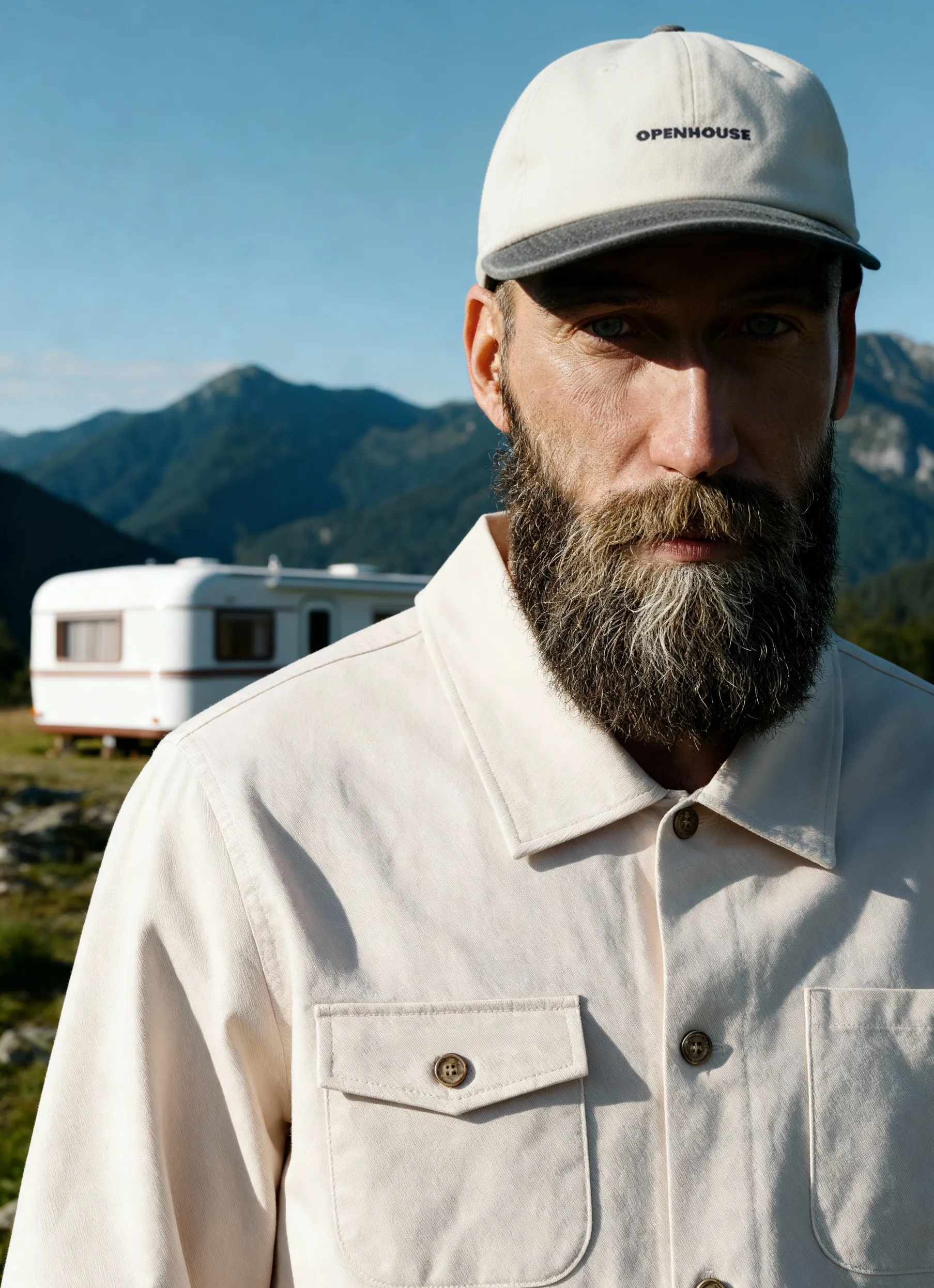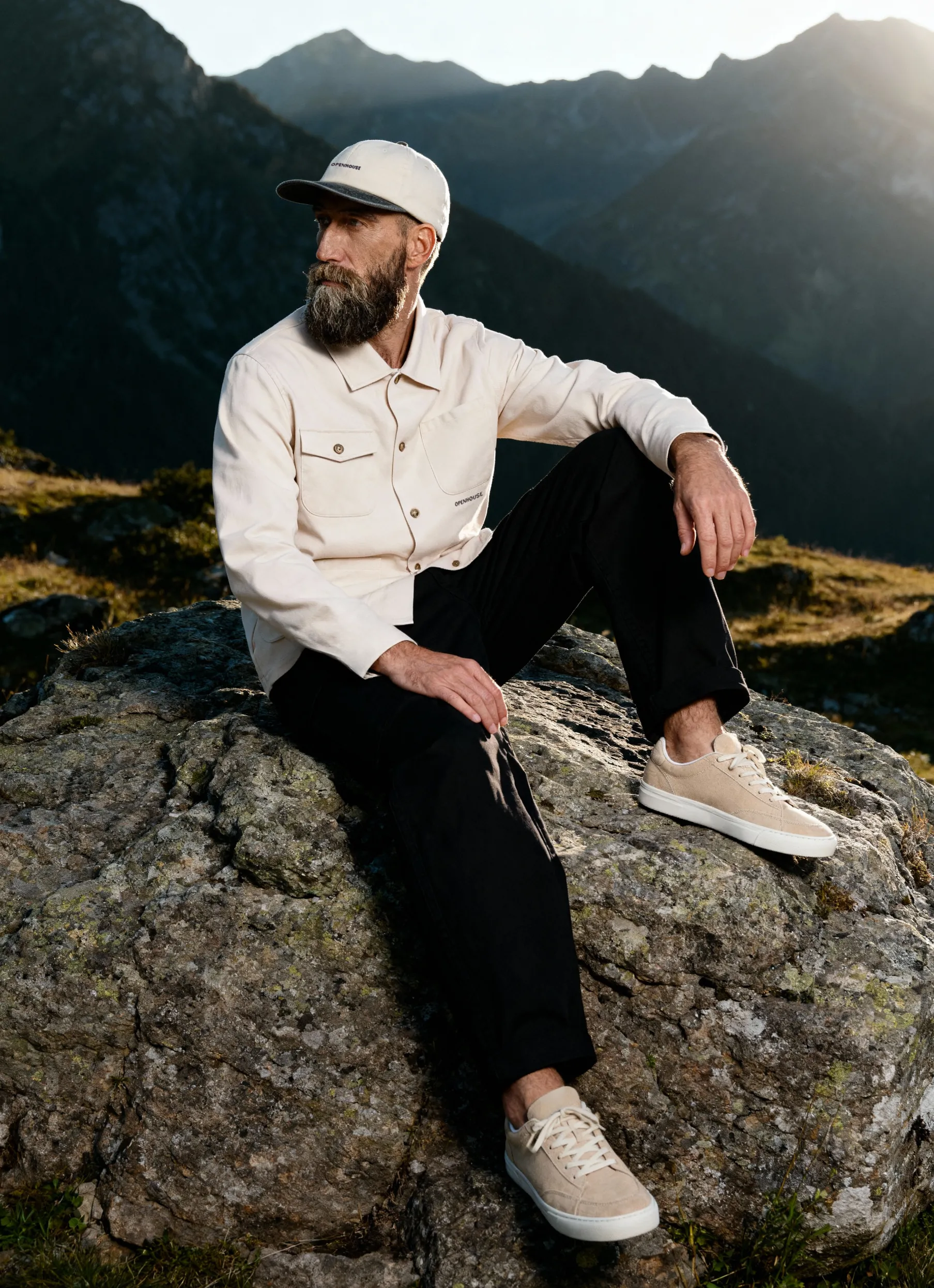
Every apparel item tells its own story through texture and tone. Photographing a black leather jacket is not the same as capturing a vivid coral shirt — each fabric and color demands a different lighting logic.
In this case study, we look at how Squareshot’s New York studio handled two contrasting apparel projects. The first featured all-black garments with diverse textures — lace, leather, and cotton — while the second showcased a bold, color-forward collection.
Through these two examples, we’ll explore how the same production framework flexes to highlight fabric detail, manage color accuracy, and maintain brand consistency. The insights come directly from our in-house producers, offering a rare behind-the-scenes look at the thinking that drives Squareshot’s apparel photography.
The Brief & Project Scope
Both projects were part of Squareshot’s ongoing apparel production for e-commerce clients. While the studio workflow followed the same core process — from briefing and shot list creation to lighting setup and retouching — the visual objectives were very different.
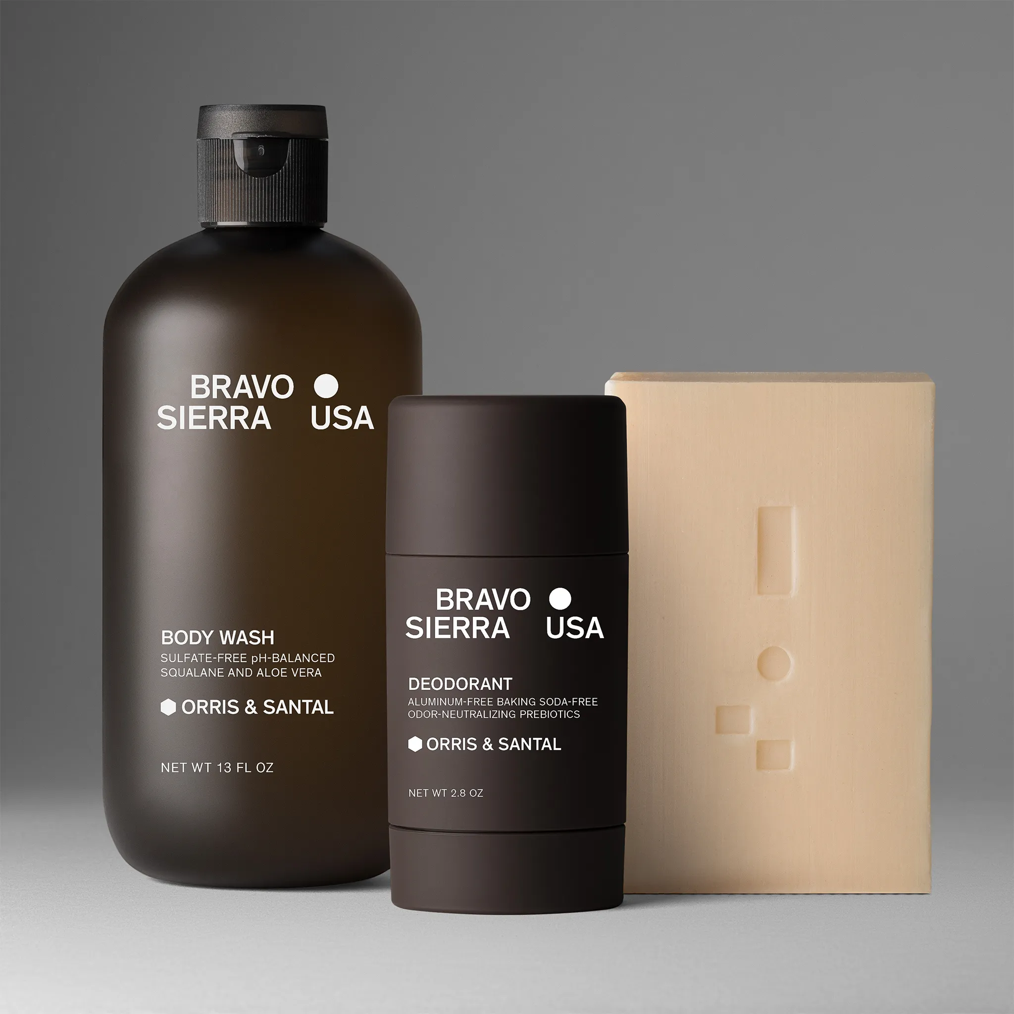
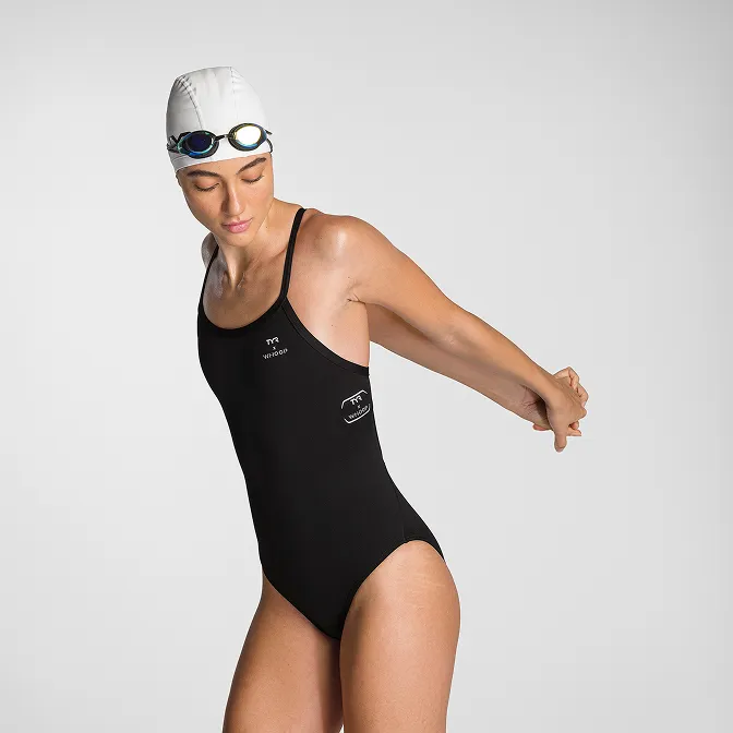
Case 1 — The All-Black Edit
- Deliverables: 63 ghost mannequin shots
- Objective: Reveal texture, fabric structure, and tonal range within deep blacks.
- Creative Direction: Minimalist, neutral, and precision-focused.
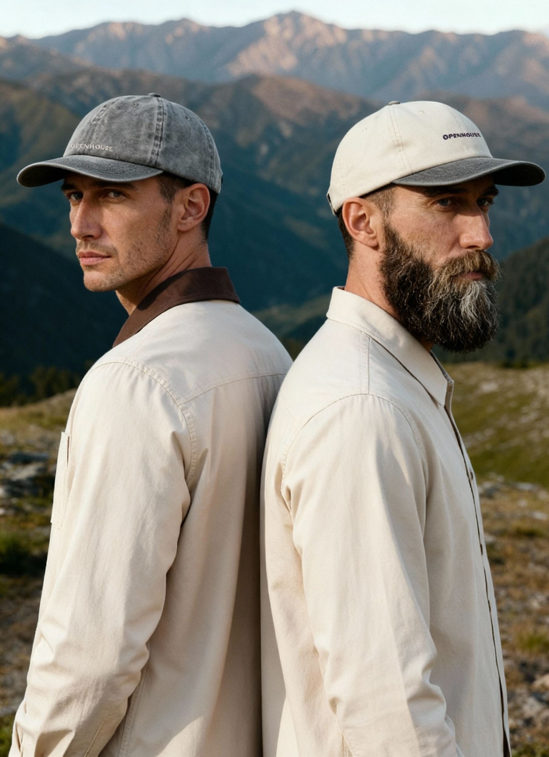
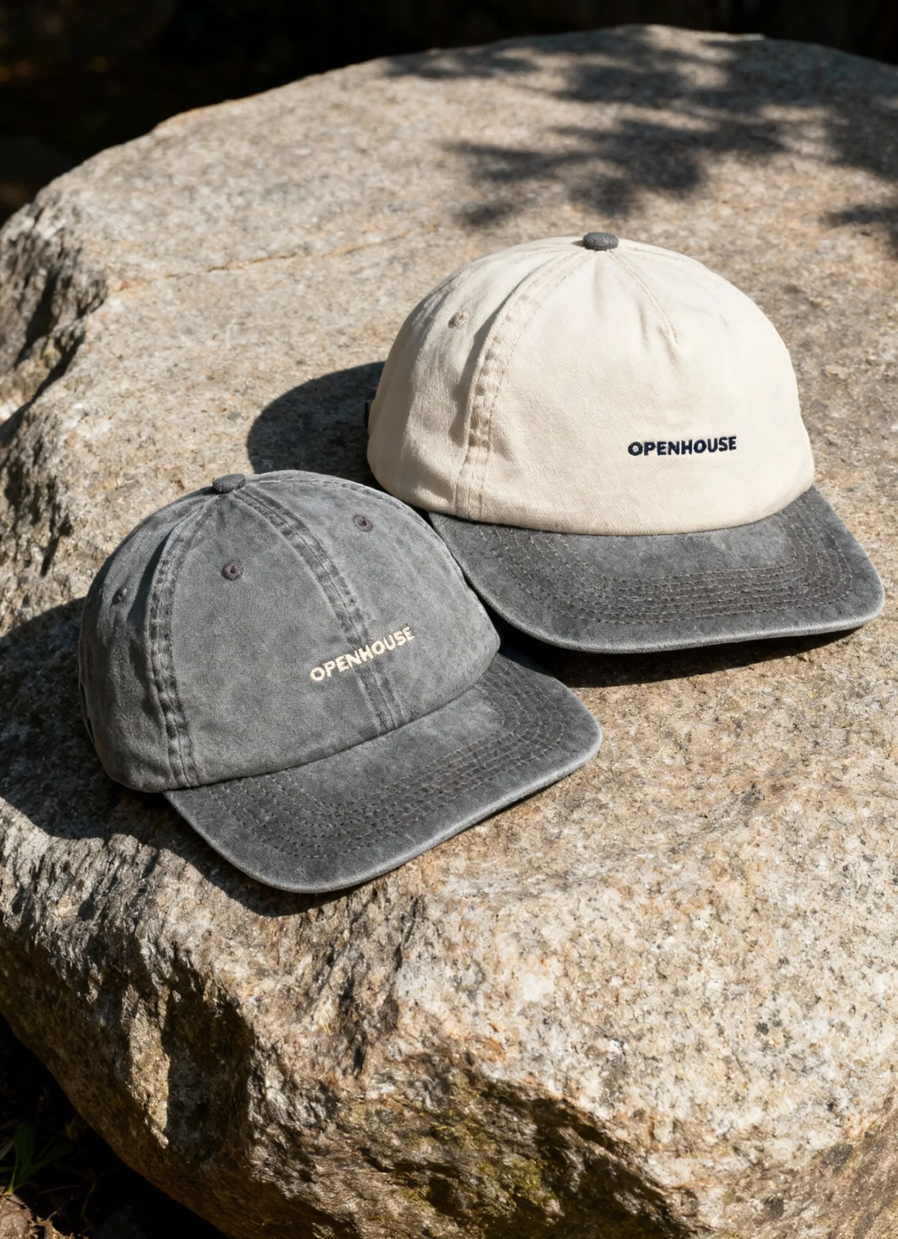
Case 2 — The Color-Forward Collection
- Deliverables: 120 total images — 66 close-ups and 54 flat lays
- Objective: Preserve hue accuracy and visual balance across a vibrant palette.
- Creative Direction: Expressive, energetic, and color-driven.
Despite their visual contrast, both projects followed the same streamlined workflow and resulted in brand-ready imagery tailored to each client’s e-commerce needs.
The First Shoot: Bringing Depth to Black


Lighting Setup & Exposure Control
Shooting black-on-black apparel introduces one central challenge — maintaining detail without flattening texture. The team worked with controlled, directional lighting and subtle fill to bring out tonal variety across materials such as lace and leather. By fine-tuning exposure and diffusion, every crease and fiber remained visible without losing the clean, uniform look required for online listings.
Styling for Texture and Shape
Each garment was arranged on a ghost mannequin to preserve natural drape and fit. The styling focused on smooth lines and a balanced tension to avoid unwanted wrinkles or folds that could distort texture. Careful positioning ensured visual symmetry while maintaining a consistent look across all 63 images.
Post-Production Precision
The retouching phase emphasized shadow recovery and micro-contrast adjustments to restore subtle material differences. Attention to edge detail and consistent lighting across the batch ensured a cohesive gallery — essential for maintaining visual trust on a product page.
As noted by Anastasia Heltsel, Squareshot Producer, this precision extends to how each fabric is handled in post.
“We use masks to keep consistency with shape across the same types of clothing. But yes, sometimes we apply different retention techniques when editing different types of materials.”
In this context, masks refer to digital selection tools that allow retouchers to isolate specific parts of a garment — preserving uniform shape and alignment across images while fine-tuning edits to match each fabric’s texture and reflectivity.
This approach allows the team to maintain uniformity while adapting retouching depth to each fabric’s unique surface behavior — from matte cotton to reflective leather.
The Color-Forward Shoot: Balancing Texture and Color
Lighting & Color Balance
For this shoot, the team faced a dual challenge: preserving fabric texture while maintaining precise color accuracy across a vibrant palette.
The lighting setup was fine-tuned with soft diffusion and carefully balanced color temperature to prevent hue shifts or reflections. Continuous calibration across all sets ensured reds, yellows, and blues stayed true to their real-life appearance — rich in depth, yet natural in tone.
Styling & Art Direction
This shoot allowed for more creative freedom. The team experimented with flat lays and close-up compositions that emphasized movement and layering. Subtle folds added dimension, while spacing and alignment kept the layout visually calm — letting the colors speak without overwhelming the frame.
According to Kate Kutuzova, Squareshot Producer, background colors often come directly from the client’s brand guidelines:
“Usually, background colors are requested by the clients to match their websites. Sometimes it happens that the apparel color looks blunt on the background, and we can add more contrast or shadow — but there’s only so much we can do when the background and item colors don’t work well together.”
Post-Production Workflow
Color correction and consistency were key. Each image was matched to a reference sample under standardized studio lighting. During retouching, the team used calibrated monitors and color targets to fine-tune tone accuracy.
Kate adds:
“Green colors are usually the most difficult to achieve right. But our editing pipeline remains the same — we use color passports that we photograph with each setup so that we have all the color data for accurate matching.”
The outcome: cohesive imagery across fabrics and shades — color-true, balanced, and ready for both e-commerce and social use.
The Results
Both projects demonstrate how Squareshot’s adaptable workflows deliver consistent results across distinctly different apparel types.
For the all-black apparel shoot, the team produced 63 ghost-mannequin images focused on texture definition and shadow control. The outcome was a clean, balanced gallery that preserved every fabric detail and tonal variation — from matte cotton to glossy leather.
For the color-forward shoot, the team delivered 120 images — including 66 close-ups and 54 flat lays — with an emphasis on color precision and hue consistency. The final set appeared cohesive, true to each swatch, and full of visual energy that reflected the brand’s expressive palette.
Both projects followed Squareshot’s standardized production workflow, ensuring consistent backgrounds and web-ready formatting across all deliverables.
Key Takeaways
- Every fabric demands its own light. The difference between leather and linen is not just visual — it defines the lighting logic behind the shot.
- Process consistency enables adaptability. Squareshot’s structured workflow allows the creative team to respond to any material or color challenge without sacrificing speed.
- Expertise is in understanding materials. Beyond equipment or presets, high-quality apparel photography depends on knowing how fabric and color behave under the lens.
Whether it’s deep blacks or bold hues, your apparel deserves photography that works as hard as your brand does.
Product A
SQUARE SHOT