Poth entered the beauty world with a clear mission: create uncomplicated skincare backed by effective formulations. Their products are thoughtful, minimal, and ingredient-forward. But as a newly launched brand, none of that would be visible to a customer without a strong visual foundation.
Before a shopper ever holds a jar or pumps a serum, their experience is shaped entirely by photography. Poth needed visuals that could build trust instantly — showing quality, texture, and purpose without overwhelming styling or heavy art direction.
“I wanted customers to immediately associate poth with a premium, elevated aesthetic — and then feel pleasantly surprised when they realized the products were offered at a more accessible price point,” shared Charles Warden, the Founder of poth.
That’s where Squareshot came in.
The Challenge: Communicating a New Beauty Brand Without Words
Poth didn’t have a legacy brand identity, a visual universe, or years of content to lean on. Their value lived inside the formulation:
- clean, simple ingredient lists
- textures that feel sensorial yet lightweight
- amber glass packaging with a bold red label band
- a minimalist, gender-neutral brand voice
The problem?
Customers can’t feel texture or read intentions — they can only see images.
“The biggest challenge was not yet having a clear picture of who our customer was or how to speak to them visually. At that stage, we were relying heavily on intuition, supported by early brand development insights, rather than established data.”
— Charles Warden, Founder of poth
The brand needed photography that would:
- look premium enough to compete with established beauty players
- remain minimal, approachable, and honest
- highlight textures in a sensorial but not editorially “over-styled” way
- provide a consistent foundation, they could build their website and product pages around
For a first-time buyer, these images would be the brand.
They had to be accurate. They had to be clean. They had to be clear.
Our Approach: Building a Visual System for a Beauty Launch
Squareshot produced a complete suite of launch assets — mixing e-commerce clarity with carefully considered stylistic touches.
1. White-background e-commerce images
These became the backbone of poth’s website.
- Neutral, distraction-free presentation
- True color and shape accuracy
- Perfect compatibility with the brand’s warm beige site background
- A premium yet simple look that aligns with their “beautifully made” positioning
These shots made it easy for shoppers to see exactly what they were buying — no guesswork, no hidden details.
-min.jpg)
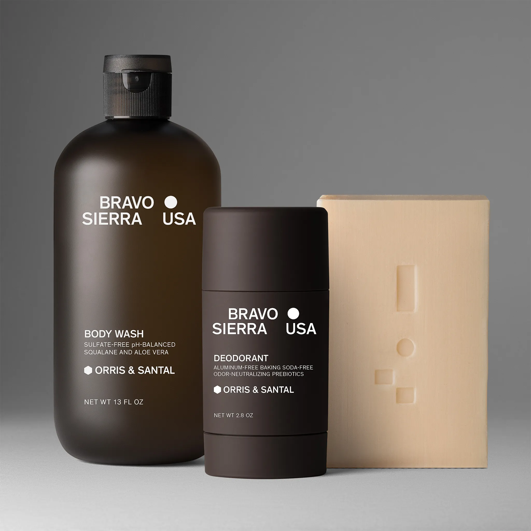
2. Soft grey-background product variants
To add depth and nuance without drifting into lifestyle territory, we delivered a series of grey-background images.
- Slightly elevated and editorial
- Ideal for sets (serum + cream + moisturizer)
- Visually richer but still shop-friendly
Poth uses these for category banners and bundle presentations to create a cohesive, scrollable experience.
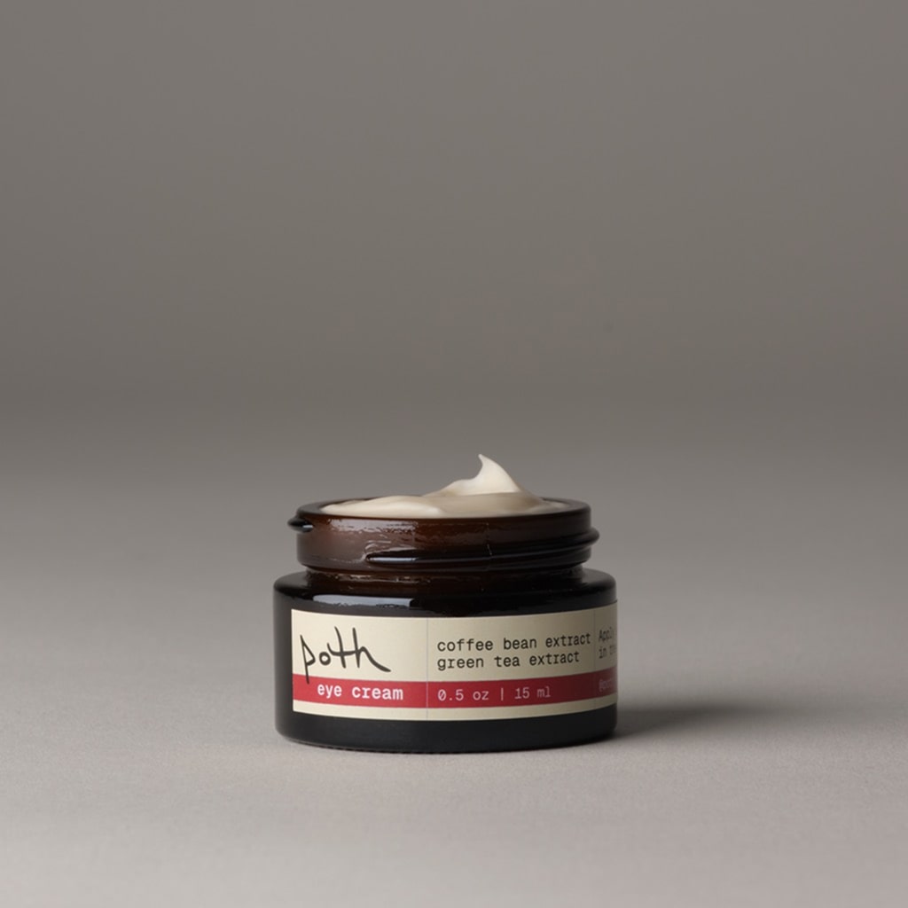
3. Swatches that tell a texture story
This was key for poth. Their formulations are lightweight, gel-based, and designed to absorb quickly. Swatches allowed us to show that — in a single glance.
- Moisturizer texture shown as a smooth gel-cream
- Serum droplets illustrating consistency
- Clean, bright lighting for honest representation
On their website, poth paired these images with handwritten ingredient callouts (“hyaluronic acid,” “jojoba oil”) — transforming our swatches into the heart of their storytelling.
-min.jpg)
It’s simple, but incredibly effective.
4. A visual identity customers recognize instantly
Together, these assets created a system:
- consistent lighting
- minimal styling
- clear product hierarchy
- neutral color environments that elevate amber glass and red accents
This became the visual language for their launch — and the structure they continue to build on.
The Result: A Young Beauty Brand That Looks Established
Poth launched looking polished, intentional, and cohesive — something most new beauty brands struggle to achieve in their early months.
“Even as a small, new brand, we consistently receive positive feedback on the quality of our imagery and photography. That visual polish helps build interest and credibility with customers before they even decide to try the products.”
— Charles Warden, Founder of poth
Poth now uses Squareshot assets across:
- homepage hero banners
- shop grids
- product detail pages
- “About the Products” educational section
- bundle presentations
- promotional, and sale modules
The images do more than “show product.”
They communicate trust, texture, and simplicity, reinforcing the brand’s identity at every touchpoint. Before customers try the moisturizer or open the serum, they already understand what makes them special.
The visuals do the explanation work.
Closing Thought
Launching a skincare brand means designing an experience customers will trust without ever touching the product. Poth leaned into clarity, consistency, and texture — and together, we built a visual foundation that lets their formulas shine.
They launched with intention. And the images carry that intention forward.
Product A
SQUARE SHOT


-min.jpg)


