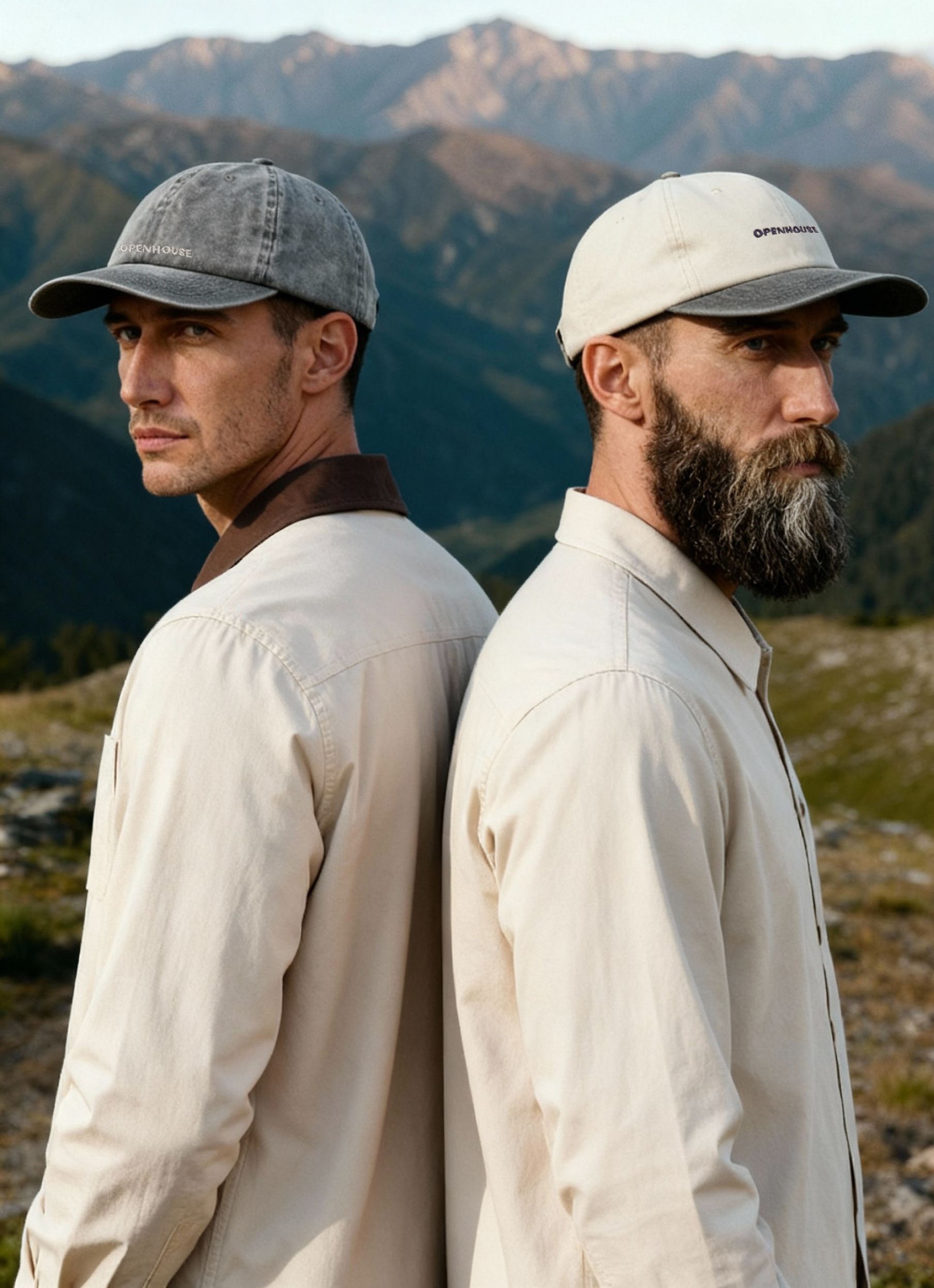
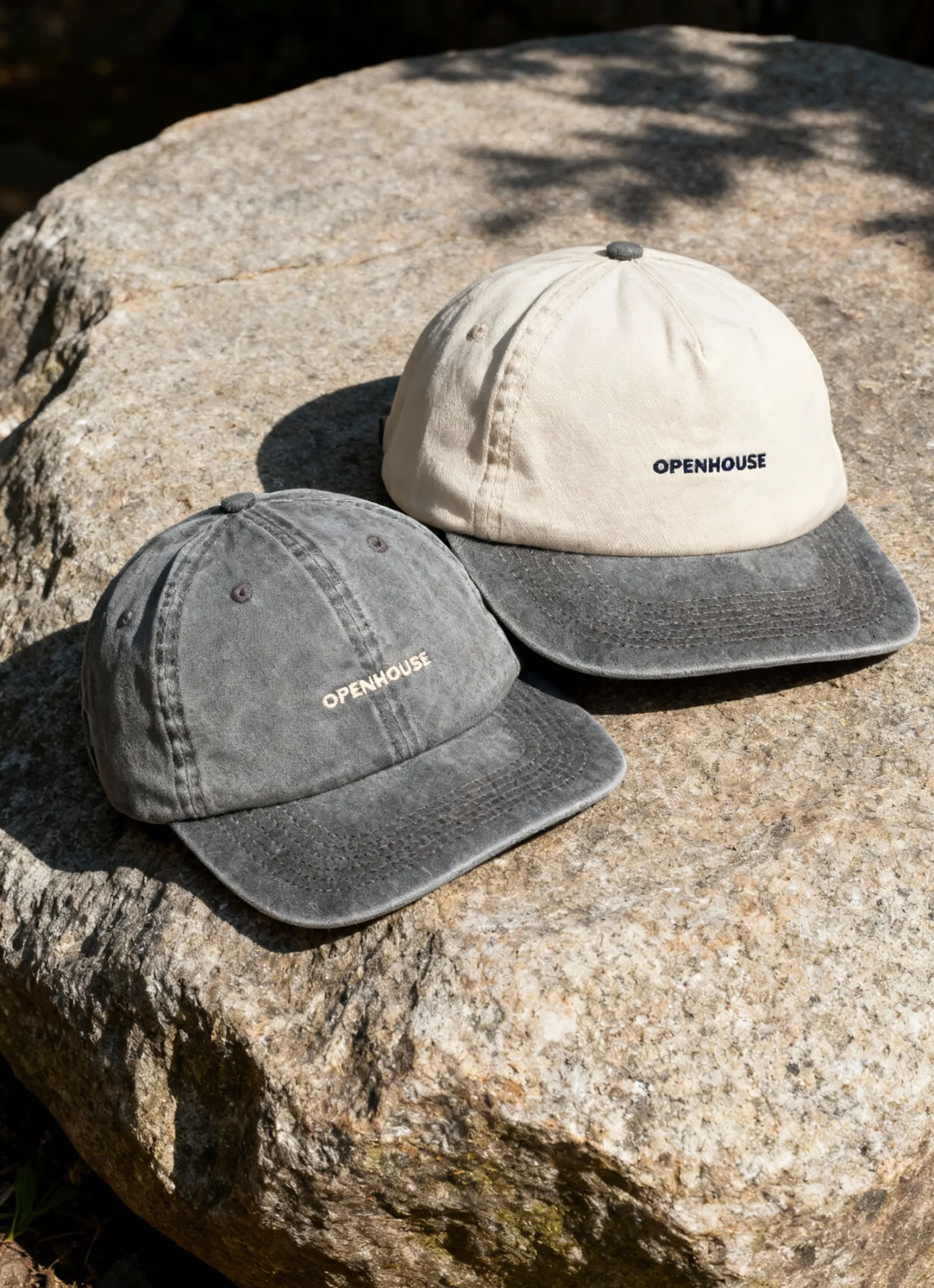
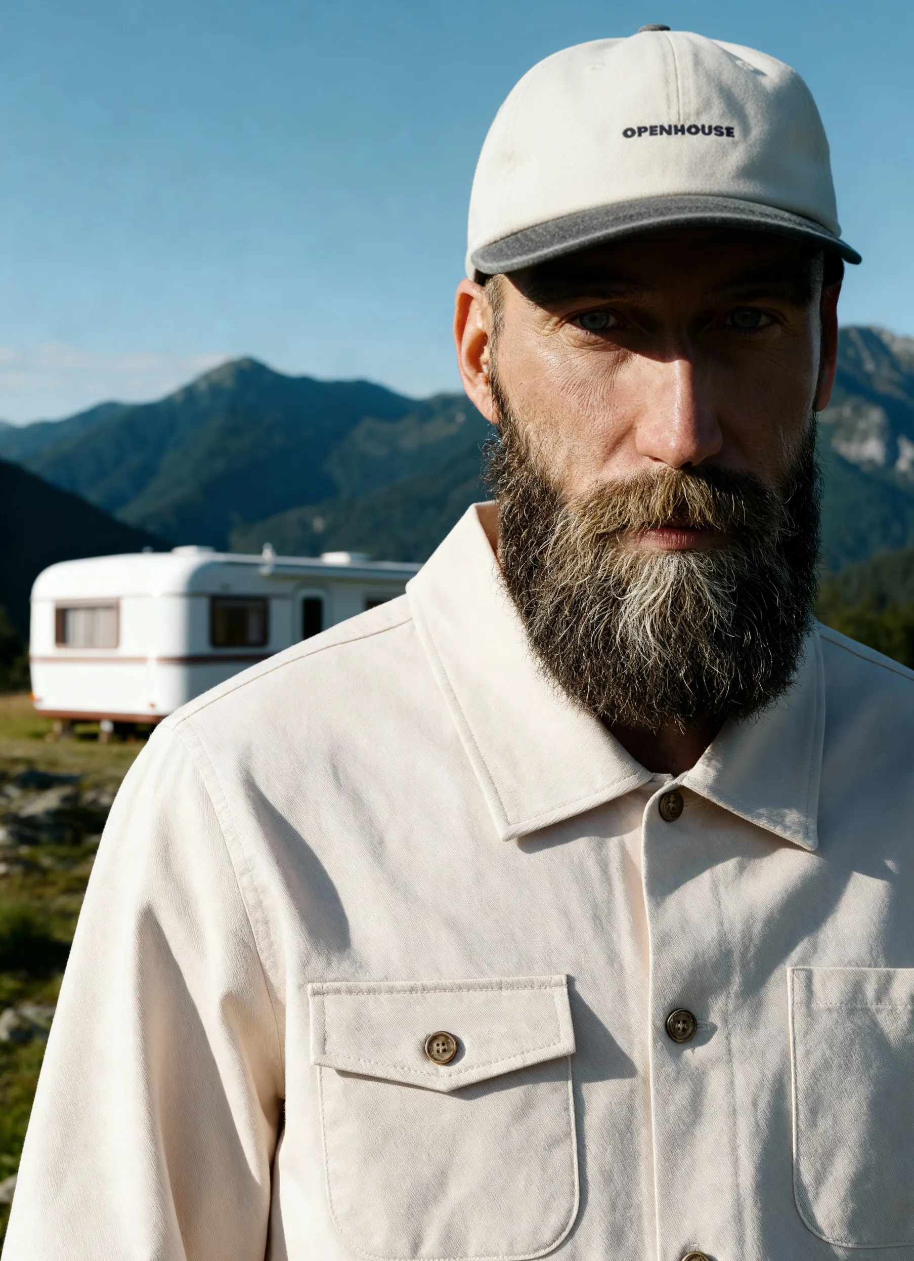
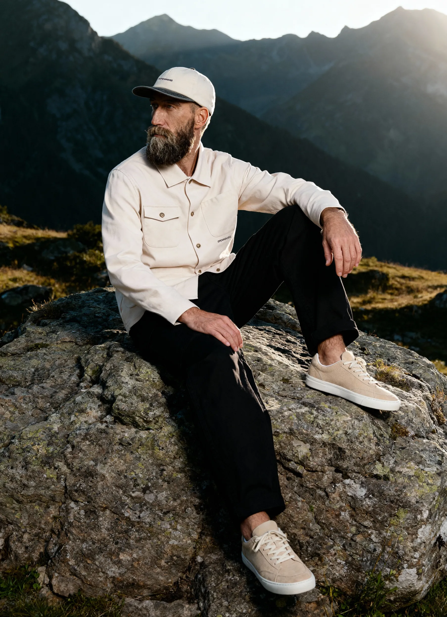
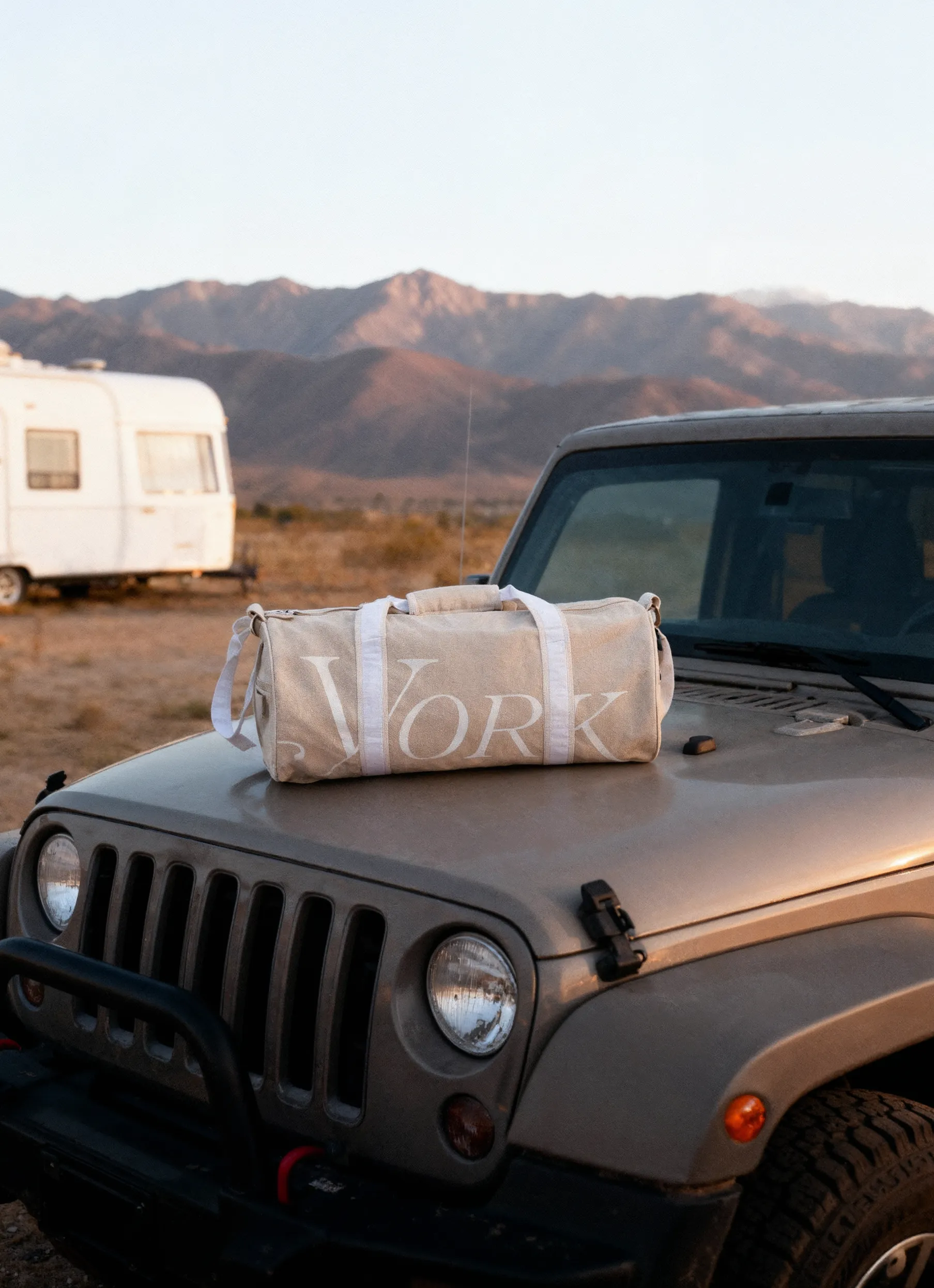
Openhouse sits in a unique space. They design and produce custom product collections for brands — everything from merch to membership kits and retail goods. Unlike typical consumer brands, they work behind the curtain, acting as a product development studio that turns ideas into tangible products.
Their value proposition centers on three pillars: design, quality, and intentional branding.
But those words remain abstract until someone sees what they actually make. A logo embroidered on a hoodie. A carefully sourced fabric. A custom bag with details that aren’t visible until the product is held — or photographed.
To communicate their offering, Openhouse needs a way to show the quiet, meticulous thinking that goes into each item.
That’s where the story really begins.
The Communication Challenge
Openhouse doesn’t operate like a traditional lifestyle brand. They don’t produce seasonal campaigns. They don’t have models, styled sets, or a world-building aesthetic that lives across ads and social assets.
What they do need is to:
- pitch new clients,
- demonstrate quality,
- communicate design decisions,
- and show the breadth of their production capabilities.
But much of what they sell — experience, thoughtfulness, intention — is not directly photographable.
You can’t photograph “experience.”
You can only photograph the products that express it.
So the visuals had to do the job of a campaign without being a campaign.
They had to be clear enough for procurement teams, inspiring enough for brand teams, and consistent enough to serve as a long-term asset library.
This is precisely where white-background photography, when executed well, becomes a strategic tool — not a formality.
Why Photography Matters for Companies Like This
For a company like Openhouse, product photography isn’t a check-the-box task. It’s a communication system.
- It sets the tone for how their work is perceived. When your promise is “quality,” every pixel needs to prove you’re not overstating it.
- It becomes the foundation of visual identity. Without elaborate campaigns, photography is the brand world.
- It works across more than marketing. These images support investor decks, pitch presentations, catalogs, and internal product overviews.
- It shapes how clients judge craftsmanship. Clean, neutral imagery makes differences in stitching, structure, or material integrity visible.
For Openhouse, photography is not an afterthought — it’s a core part of how they tell their story.
Squareshot’s Role
Across eight shoots in eight months, Squareshot became a long-term production partner rather than a transactional vendor.
What this looked like in practice:
- Consistent execution across changing samples and evolving collections
- Support for a wide range of categories: apparel, bags, accessories, soft goods
- Clear communication and repeatable workflows that matched Openhouse’s production cycles
- A growing asset system instead of isolated image sets
- Adaptability as items arrived in different stages — prototypes, pre-production samples, final runs
This rhythm allowed Openhouse to scale its output without sacrificing cohesion.
Each shoot built on the last, gradually forming an image library that could flex with the brand as it grew.
Approach
Multi-Category Production
Openhouse’s products span a wide range of materials and form factors — canvas bags, structured accessories, lightweight apparel, hardware details, and more. Each requires its own handling, but the end result still needs to feel unified.
To achieve that, we:
- Developed a lighting setup that preserved material integrity
- Created a styling logic that kept products clean, intentional, and stable
- Balanced consistency with nuance — making sure a canvas tote doesn’t read the same as a nylon pouch or a knit hoodie
- Adjusted workflows to suit the category: fabric prep, structure support, detail angles, and hardware reflections
The goal was to make it feel like all items lived within the same brand ecosystem, no matter how different they were.
Brand Consistency Without Brand Guidelines
Openhouse had an initial idea of their visual direction. Photography became the framework that made it real.
A neutral background system allowed them to:
- build layouts with flexible negative space
- use imagery across decks, web, Instagram, and print
- adapt visual tone simply by layering typography and color blocks
- maintain long-term consistency without limiting future creative directions
In other words, photography wasn’t made to fit a brand guide. It became the brand guide.
Systematized Workflow
Because Openhouse produces regularly — and often under tight timelines — we aligned our process with their internal cycles:
- Flexible, on-demand shoots aligned with production pace
- Guided, customized shot lists for consistent structure
- Organized asset delivery built for reuse across multiple formats
This system reduced friction and allowed both teams to move quickly without compromising detail.
Case Inside the Case: How Openhouse Turns Product Photography into Brand Expression
One of the most interesting parts of this collaboration is how Openhouse uses the imagery.
On Instagram and in their pitch decks, they mix lifestyle content with something more distinctive: designed layouts built almost entirely from clean product photos — including those produced at Squareshot.

They treat white-background photography less as functional documentation and more as raw material for design.
You’ll see:
- Product shots placed into modular grids
- Imagery framed with typography-heavy layouts
- Negative space used as a storytelling tool
- Neutral tones acting as brand elements themselves
This creates a polished, design-led feed that doesn’t rely on traditional campaign production.
It feels intentional, scalable, and aligned with what Openhouse stands for: thoughtful, functional, well-executed product design.
They sell “brand experience,” and while they use lifestyle photography, much of their brand presence is built on something simpler and more scalable: designed product photography.
Here, Squareshot’s work becomes more than documentation — it becomes part of their visual language.
Results
Over the course of the partnership, Squareshot delivered a comprehensive image system that Openhouse now uses across:
- Instagram posts and carousel layouts
- Sales decks and pitch presentations
- Product catalogs and internal documentation
- Web pages showcasing new collections
- Client-facing project overviews
This led to several practical outcomes:
- Clearer articulation of Openhouse’s offering
- Ability to present high-end visuals without needing campaign-scale production
- Faster internal workflows for showcasing new projects
- A consistent visual baseline that grows with the brand
- A repeatable process for transitioning from idea → sample → published asset
Photography became a central part of their brand identity system — not a supporting element.
From Squareshot Producer Kate Kutuzova:
“Because Openhouse brings such a wide variety of products, our focus was on building a visual system. The challenge was to make very different items feel cohesive, repeatable, and ready for design-led layouts. One way we streamlined this was by supporting their team with shotlist creation — guiding structure, selecting references, and keeping every shoot aligned.”
Takeaways
- Not every brand needs a full campaign universe — but every brand needs visual clarity.
- White-background photography can become a brand expression when used intentionally.
- Consistency will outperform complexity almost every time.
- A systematized recurring partnership compounds value over time.
- For product-led companies, photography is not just documentation — it’s identity.
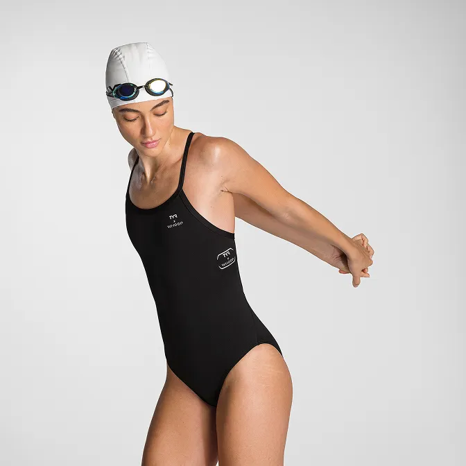
Product A
SQUARE SHOT





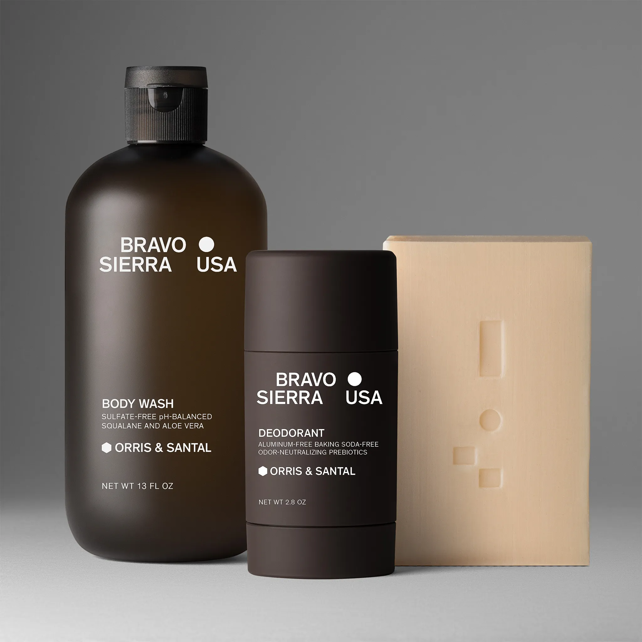
%201-min.jpg)


