
When we walked into the visual development stage, we had a clear understanding of the direction we wanted to take. We are a service, which means that we are as good as our clients.
With that in mind, we identified three key anchors around which we planned to build our visual identity: product shots as key visuals, a prototype-like feel, and simplicity.
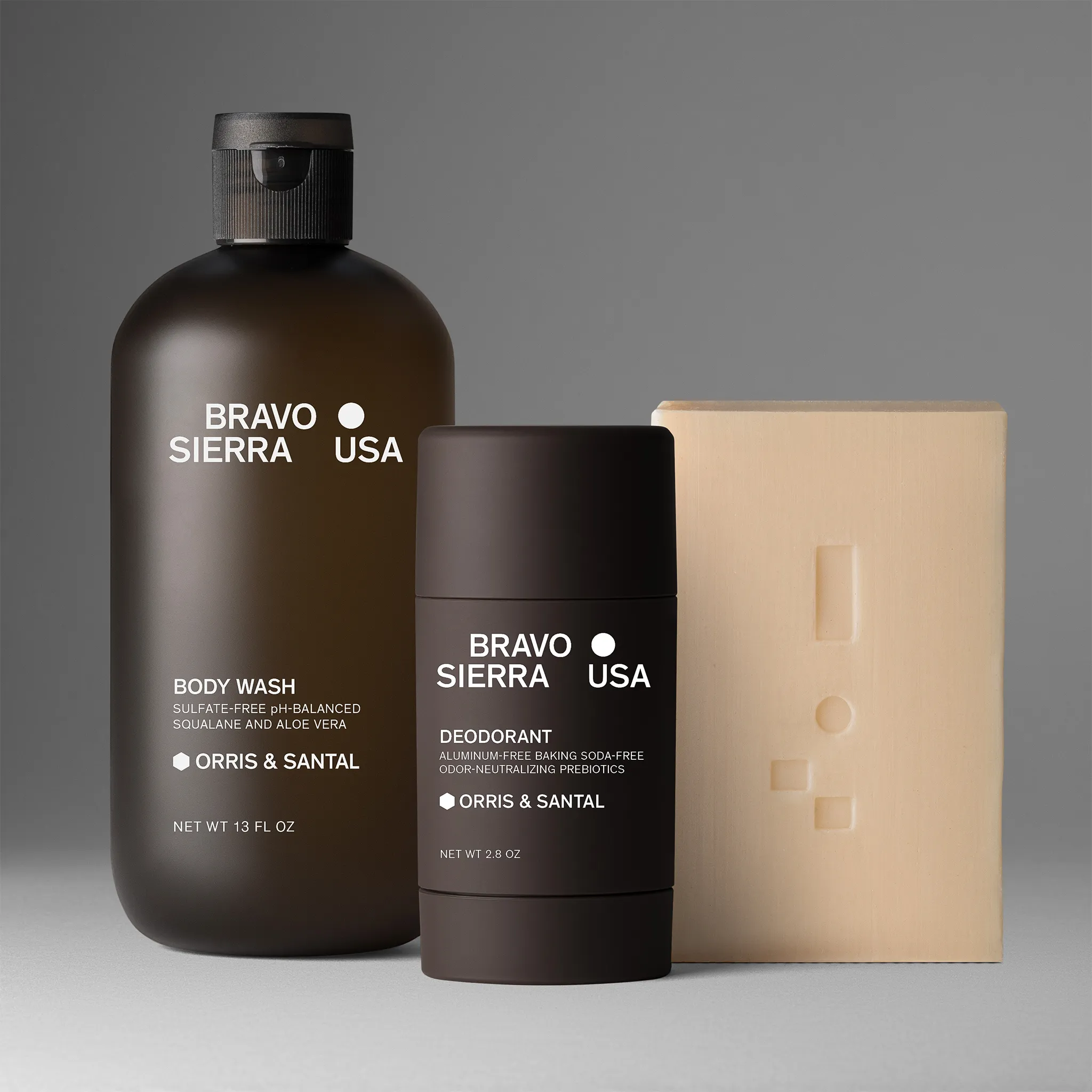
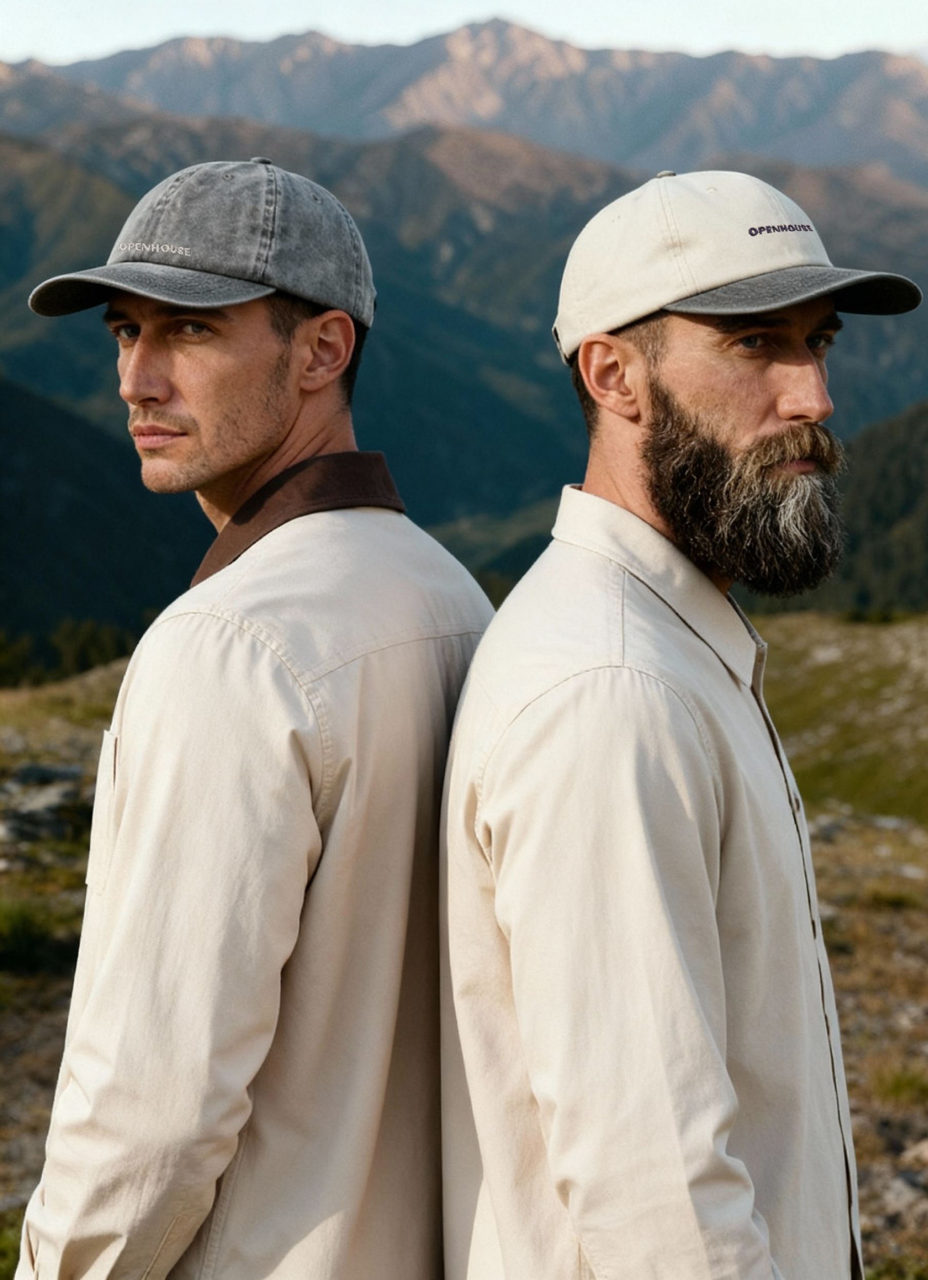
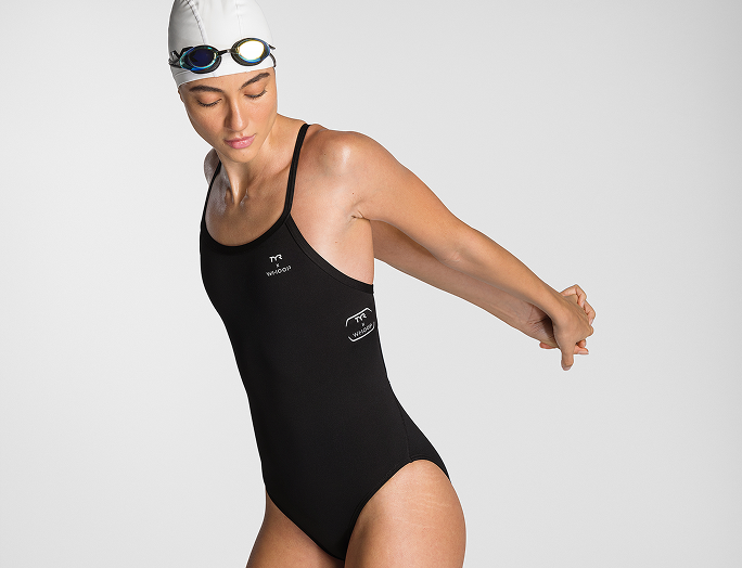
Product shots as key visuals
It was important for us that our new identity wouldn't overshadow the images that we shoot for our clients. Brands come to us because of our ability to deliver on their content needs, so we needed to emphasize the proof of work.
Prototype feel
We always perceived Squareshot as an instrument. So, we started working with a set of associations that would paint that image: digital blueprints, web layouts, and finally – prototypes. The prototype look aligned with our desire to keep the main focus on the produced content. We wanted to keep the identity raw enough to instill a sense of "work in progress", but not overdo it, risking being perceived as “incomplete”.
Simplicity
The simplicity of design was the glue to stitch our ideas together. It was crucial that our messages are easy to distinguish and the visuals do not overwhelm the observer. Simplicity evened up perfectly with our intent to bring clarity into our communication and processes.
Filling in the blank spaces
To fulfill our vision, we partnered with an award-winning Ukrainian design agency – CREVV. Their approach to integrating unique and memorable symbols into brand identity attracted us to building a brand together.
Early on in the development, we knew that the concept of our logo had to reflect the essence of Squareshot. It had to be uncompromising, as it would be the blueprint for the rest of the brand.

We went through dozens of visually attractive ideas, but the recognizable symbol that we were looking for wasn't there. We continued to go through concept after concept until we arrived at a logo that "made total sense".
.gif)
The new logo embraced a very simple and distinct concept: there's an empty space, a placeholder, which Squareshot will fill in. The logo was simple, but more importantly it was already recognizable across the board.
Have you ever had an image not load up due to internet problems? Well, that's the symbol you would see instead of an image. And if you had any experience with UI/UX design, you already know that designers use this symbol as a placeholder for visuals. The new logo became self-sufficient. It became a symbol of our work.
Pylyp Sukhenko, Brand Manager: Squareshot is the bridge between physical products and e-commerce. We are in the business of filling in blank spaces. It seems very simple when you put it like that, but being simple is incredibly hard.
Fun fact: The new Squareshot logo was one of the first logos that Alex, the co-founder and CEO of Squareshot, drew on a piece of paper when conceptualizing Squareshot in 2017. At the time, it didn't stick. Now, it made more sense than ever.
Building identity
The new logo acted as a lighthouse for the rest of the project. Since we've decided to build a brand that would hold up for years to come, we selected Inter as our main font. Inter is timeless and continues to gain popularity in printed and web design.

Another timeless, but very hard decision to make was staying away from colors. This decision supported our global vision of making product images the main characters of Squareshot. The only use of colors was permitted for hover effects and product shots backgrounds.
Social media & Squaretalk podcast
Once the basic rules were defined, we moved forward to designing the social media and podcast look. The brief for social media was quite simple: "The product images are similar to one another, so we need to stand out". That's how we arrived at the card look that slightly resembles an upside-down polaroid photo look. Our images are rarely just images. They are a representation of larger projects and collections. That's why it was important to find balance between showcasing the image as well as stating project info.


The process for developing a podcast look was more complex. Squaretalk needed its own identity without deviating too much from the rules we have established for Squareshot. Building upon our new logo, we've developed a "talking head" concept that fit well with the podcast niche.
We stayed true to the initial project blueprint but gave Squaretalk its character with an addition of an identity color.
Identity as a function
As we progressed through the design stages, we maintained a particular theme – the functionality of visuals. There was no room for blind "aestheticism". We are working with businesses, which means that project decisions are much less impulsive and much more weighed out. Squareshot has a very distinct utility of content production and brand identity should assist in conveying that utility.
This allowed us to stay focused in our decision-making and deliver a clean design. An approach that we took a step further in our website design.
In our next and final part of the rebranding series, we are going to explore the key features that we have introduced with the launch of our new website.
Product A
SQUARE SHOT