
White backgrounds dominate e-commerce. Marketplaces like Amazon and Walmart even make them mandatory. But when you’re shooting outside of those platforms, the backdrop becomes a creative choice — and the color you pick can make or break how your product is perceived. To narrow it down, start by asking yourself:
- Where will this image be used?
- Who’s the audience?
- Should the photo feel emotional or straightforward?
- Do you want it to stop the scroll or simply inform?
- Will it be part of a styled set or kept clean?
- Does the color complement your model’s complexion?
- Should shadows be visible, or kept minimal?
- Is it worth shooting the backdrop, or should you just swap colors in post?
Choosing the right background color isn’t just an aesthetic decision — it’s a strategic one. Let’s dig into how to get it right.
Key Things to Consider When Selecting a Photography Background
Color isn’t the only factor when picking a backdrop. Material, size, texture, and setup all contribute to shaping the final result. Here’s what to keep in mind:
Size
Backdrops range from compact vinyl sheets to full-width seamless paper rolls. Size affects:
- Portability & storage — vinyl sheets (60×90 cm) are easy to carry, while 2.7 m rolls need serious space.
- Cost & consumption — paper rolls get dirty fast, so longer rolls make sense for studios that burn through them.
- Flexibility for video — a narrow roll may work for stills, but limits you in motion shoots.
Material
The surface you shoot against does more than just hold color — it also shapes durability, portability, and the overall feel of the image. Some of the most common options include:
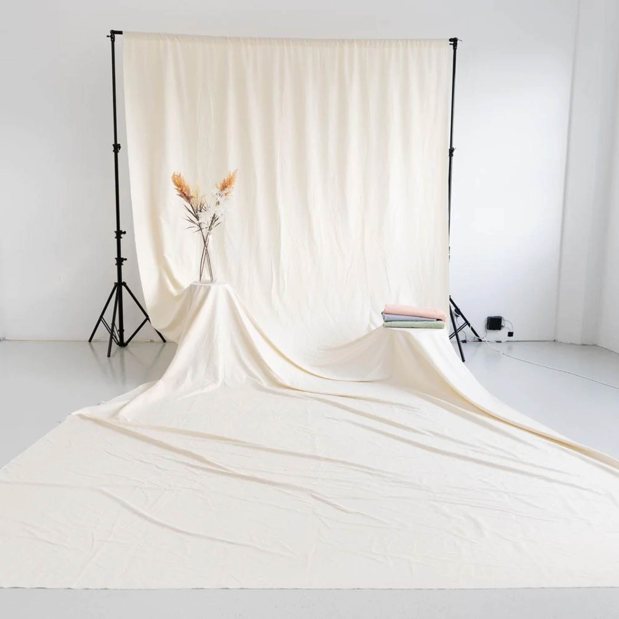
Paper — cheap, seamless, non-reflective. Disposable when dirty.
Muslin & cotton — durable, portable, with a light texture if not ironed flat. Sometimes brand-specific framing limits compatibility.
Vinyl — durable, small-scale, easy to store. Often printed with textures like tile, brick, or marble — great for beauty and cosmetics, though flat in macro shots.
Fabrics (silk, satin, faux fur, sequins) — more common in lifestyle or social campaigns. Each brings a mood: silk = luxury, fur = edgy chic, sequins = glam.
Texture
Even when two backdrops share the same color, their texture can change the entire mood of a photo. It’s worth considering how the surface will:
- Influences light — reflective or 3D surfaces can cast unwanted shadows.
- Competes with products — bold textures may overpower minimal items.
- Sets the mood — e.g., sequins create a playful, feminine tone, but limit broader appeal.
Setup & Fixtures
Finally, it’s not just what your background is made of — it’s how you mount it. The setup affects workflow, mobility, and creative flexibility:
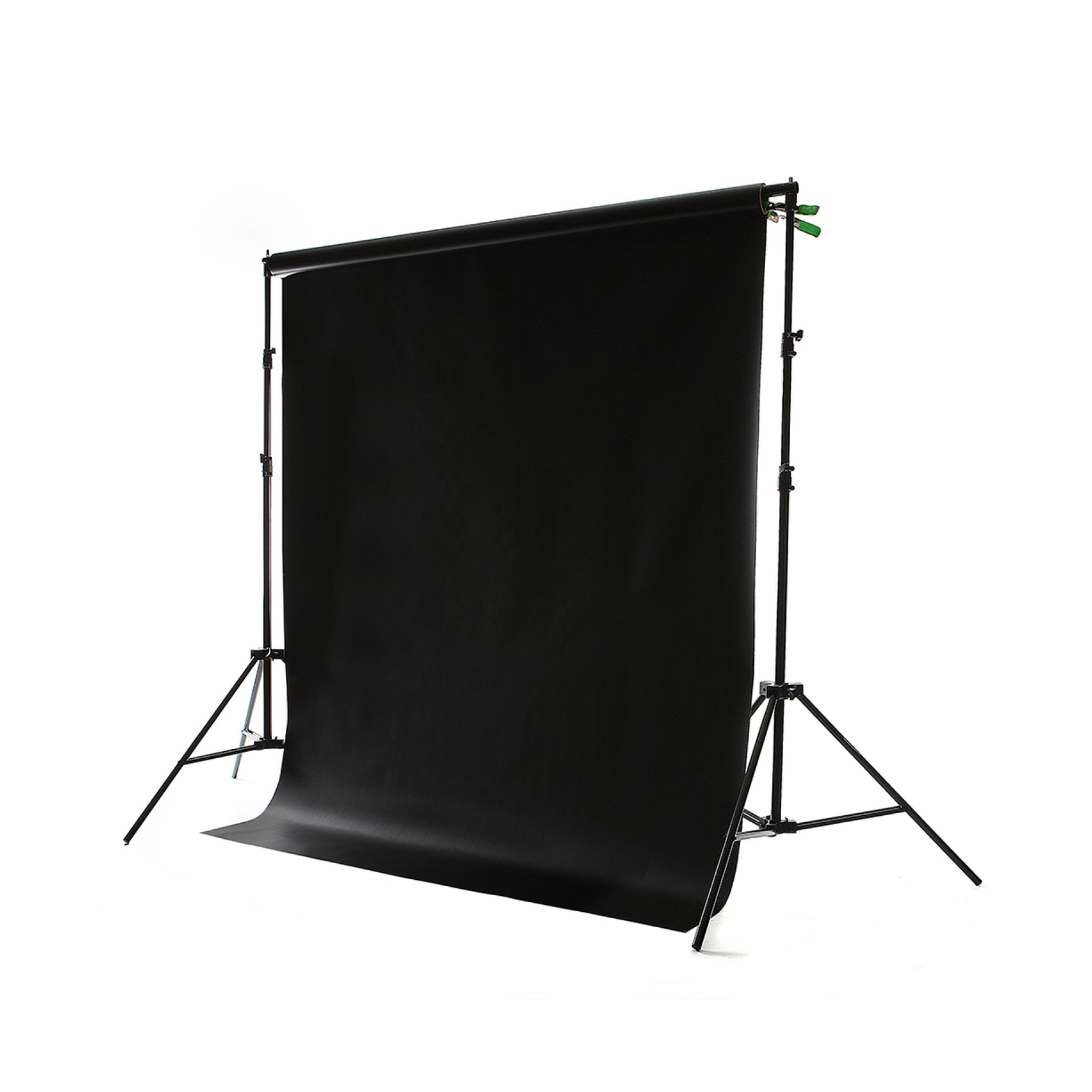
1. Wall & ceiling mounts
These may come as expensive as a used car, as they may have an electronic system of roll control etc. Wall-mounted paper rolls are often part of the professional studio, where the needs differ every day and all shades of background come in handy.

2. C-stands
C-stand with a few clips to hold the roll fixed is a more versatile, mobile, and less expensive option for professional use. You can mount both paper and fabric backgrounds on such stands.

3. Patented Frames
Some eCommerce backdrop brands, like Easy Frame®, are only compatible with their own unique patented mounts and frames. For those on a budget, you need to make sure the skins you are buying are universal in terms of mounting on a regular C-stand.
4. Flat lay background
No mounting is required for a piece of vinyl to shoot a bottle of shampoo against. Just put it on a table and maybe prop it against the wall for an infinity angle effect.
5. Collapsible pop-up screens
They are all about convenience on the go: portable, double-sided, and easy to use. You can fold them away into the holder with the handle in a minute and get going. White, black, silver, and gray are the most popular colors for collapsible photography backgrounds.
6. Cyc wall
OK, now this type of wall is a bit of a pain to do, but many proffessional ecommerce and portrait studios will go to a lot of lengths to have it. This infinity wall has no corners so that the floor seamlessly transpires into a wall.
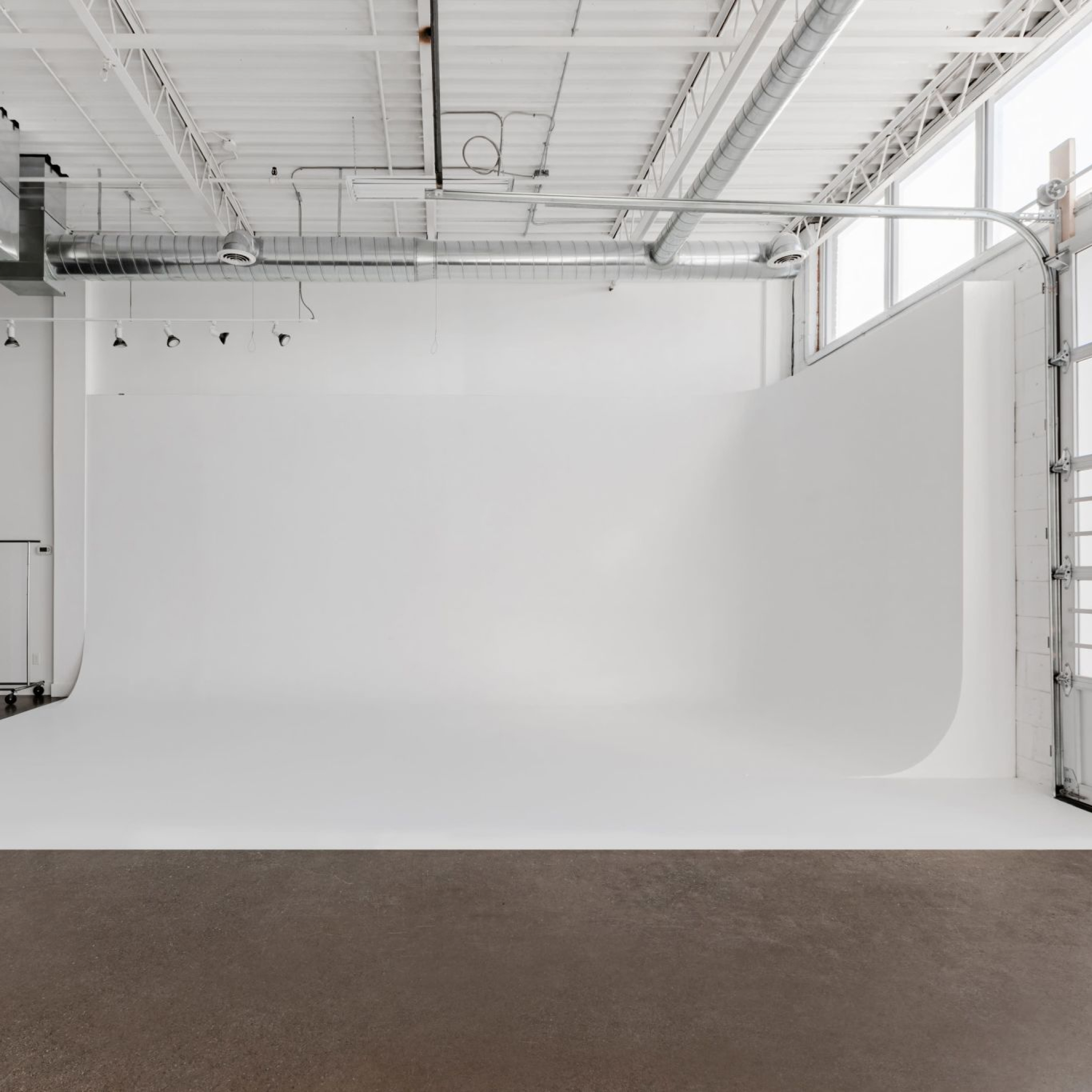
Why are we talking about the cyc walls in the context of choosing the background color for e-commerce photos? Well, it's because you can paint it during the lunch break. The paint dries fast. But overall, they are mostly white and get re-touched when the floor part becomes dirty.
However, color is a key factor when it comes to choosing a backdrop for ecommerce.
Choosing Background Color to Match Your Marketing Goals
Big agencies may charge six figures for a logo or brand book, but brand consistency doesn’t end there. Every product photo is another touchpoint with your customer — and the background color plays a direct role in reinforcing your brand identity.
Here’s how background choice aligns with different goals:
1. Showcase your product clearly
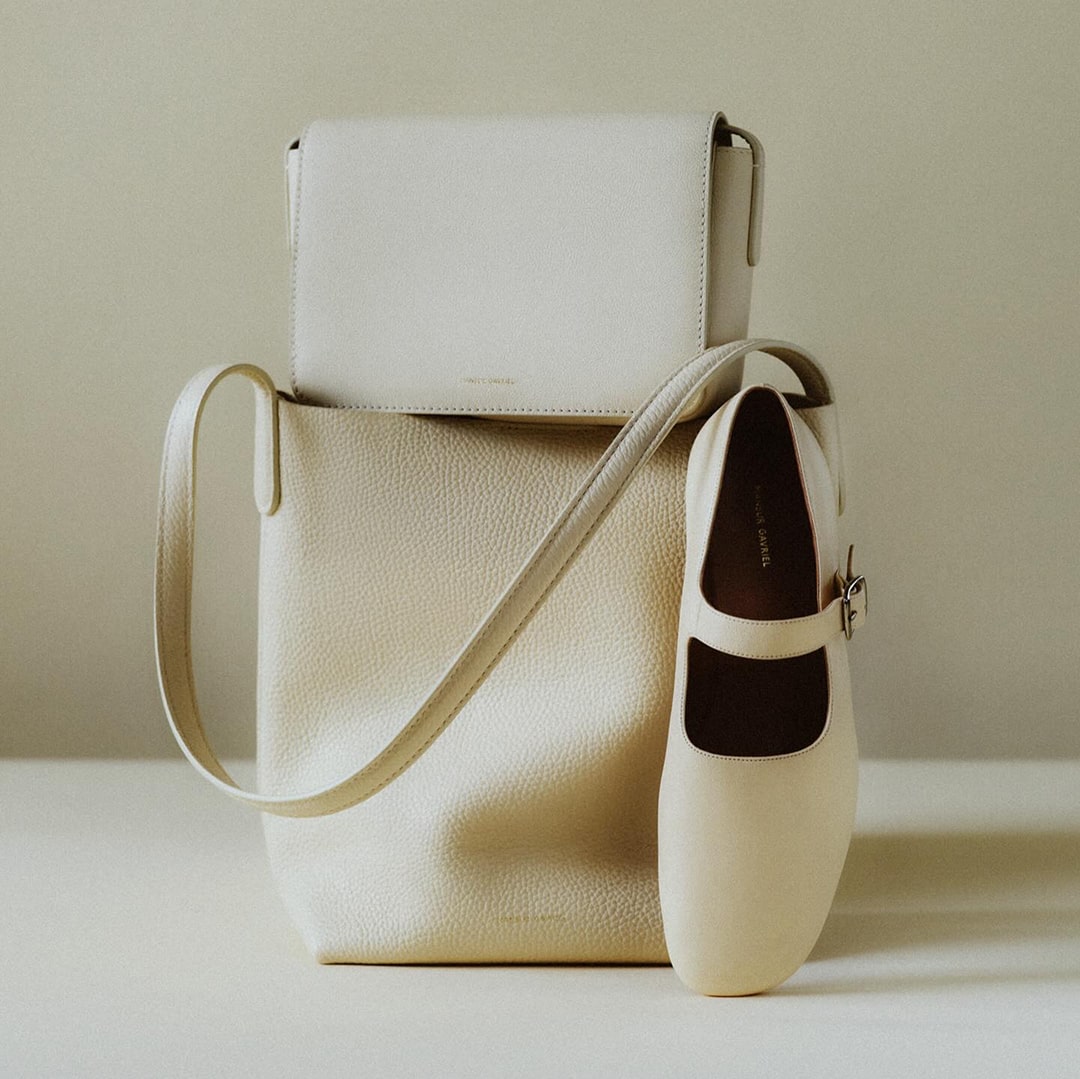
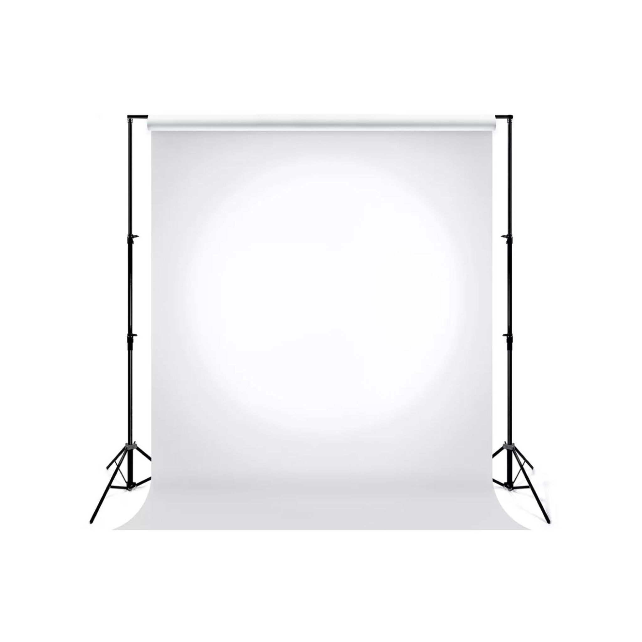
White backdrops are the closest thing to “nothingness.” They strip away distraction and let the product speak for itself. Use white when:
- Shooting product pages on your ecommerce site, where customers want details — seams, textures, colors.
- Competing in crowded marketplaces like Amazon or Walmart, where clarity and consistency matter more than creativity.
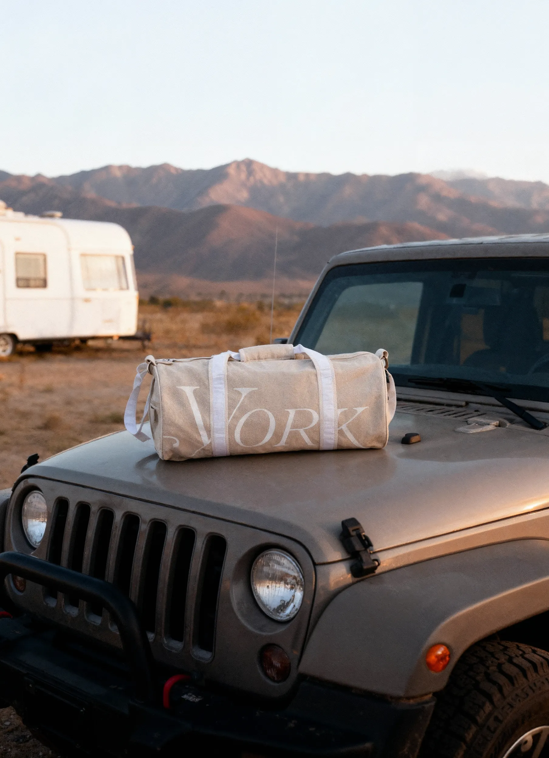
2. Grab attention on social media
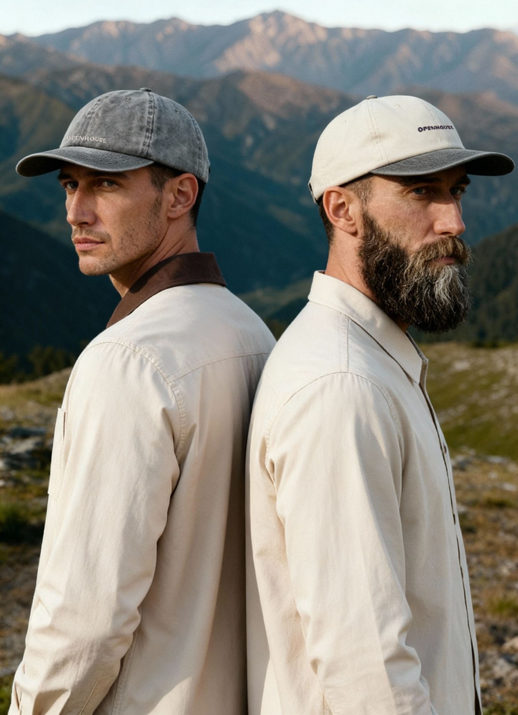
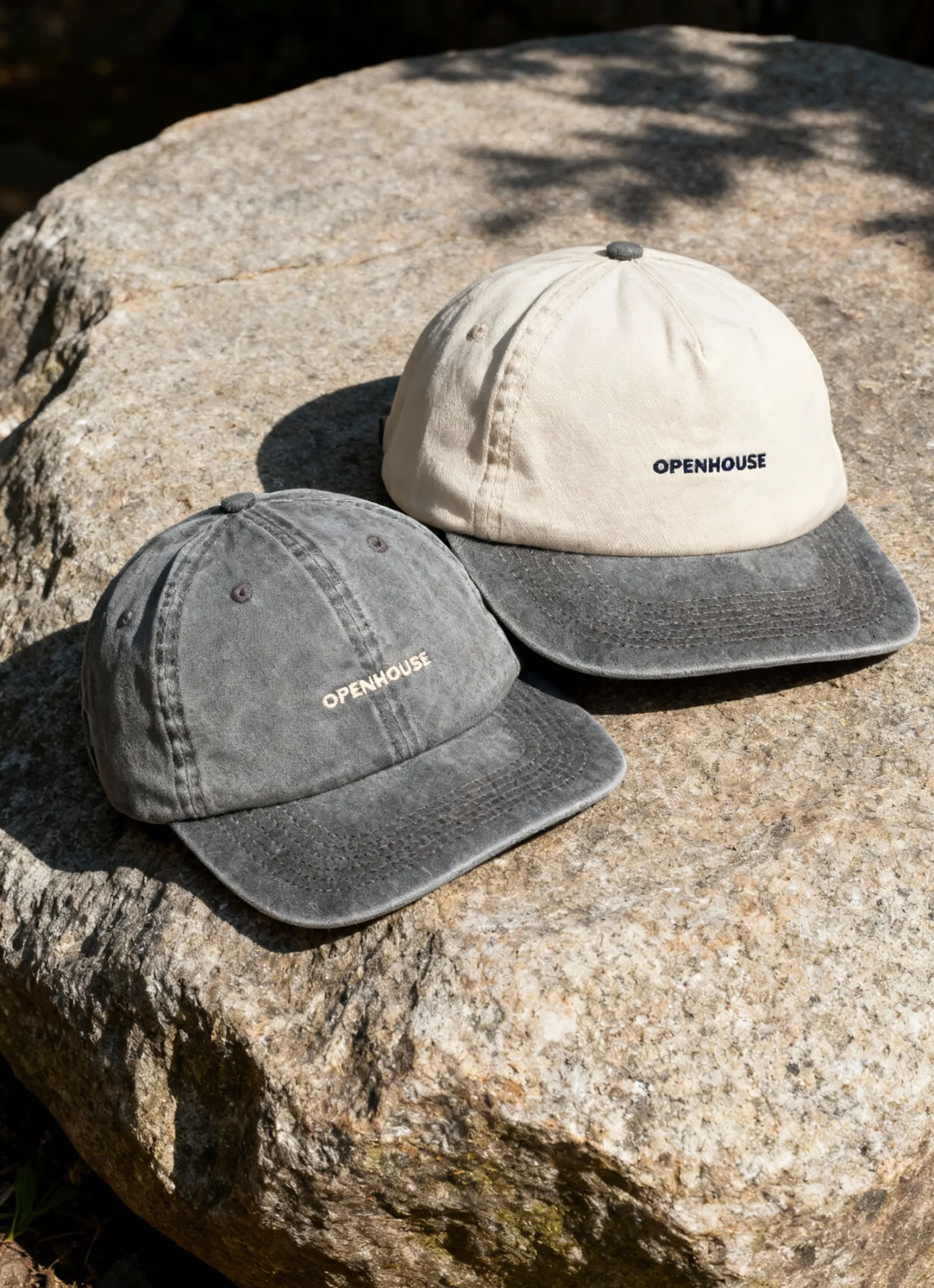
Feeds are crowded. To stand out, you often need bolder choices — textured, colorful, even glittering backdrops that compete with celebrity posts and viral content.
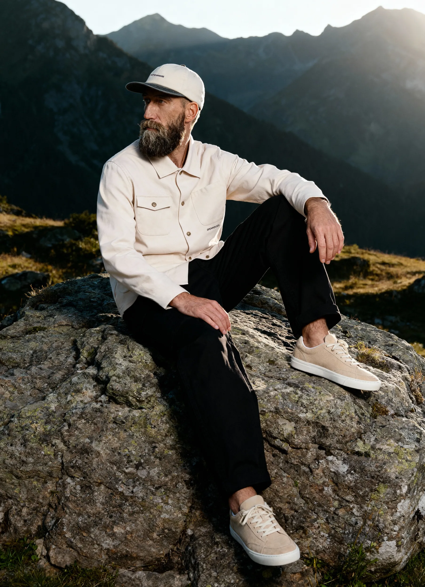
3. Create a mood
Backgrounds can set emotional tone as much as the product itself:
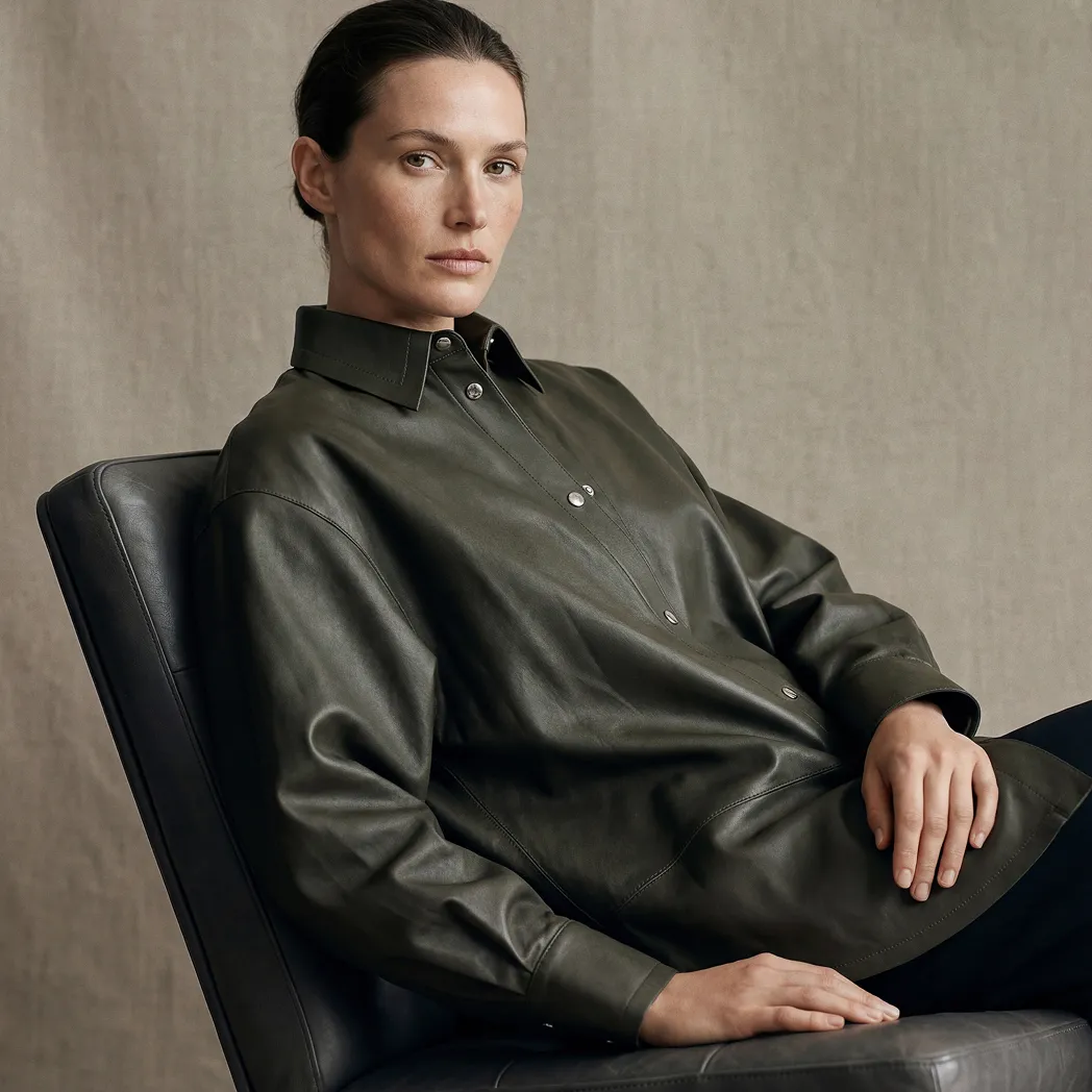
Black = sleek, dramatic, masculine, mysterious


Pastels = soft, calm, homey
Wood, marble, rust, glitter, or pink fuzz = each adds a distinct personality, from chic to playful
4. Sustain your brand
If your brand palette includes a signature color or pattern, weaving it into photography backdrops helps reinforce identity at every touchpoint.
5. Stay on trend
Colors and moods shift with seasons, fashion cycles, or cultural moments. Think Pantone’s annual “Color of the Year,” or the symbolic red and blue during election season. Tapping into trends keeps your brand visually relevant.
Lighting Considerations for Background Colors
Lighting doesn’t just illuminate your product — it changes how your background is perceived. A backdrop that looks flawless in person can appear dull, uneven, or overly reflective under the wrong lighting setup.
Reflections
Glossy backdrops like vinyl, satin, or laminated paper tend to bounce light. If your key light is too direct, you’ll end up with bright hotspots that pull focus away from the product. Jewelry and glassware are especially vulnerable, since they reflect both the background and the light source.
Pro Tip: Use a diffuser or polarizing filter to tame glare on reflective backgrounds and products.
Shadows
White backdrops can betray you — without even lighting, they often register as gray or yellow in photos. Dark backdrops, on the other hand, can absorb too much light, erasing product details. Adding a fill light or reflector helps balance contrast.
Pro Tip: Foam boards are a cheap, portable way to bounce light back and soften harsh shadows.
Mood creation
Beyond technical correctness, lighting shapes the feel of your product images. Soft, diffused setups pair beautifully with pastels or lifestyle scenes, creating a cozy, approachable look. Hard, directional light emphasizes edges and texture, perfect for black, stone, or metallic backdrops when you want bold, dramatic imagery.
Pro Tip: Colored gels on your lights can subtly align the background mood with your brand style guide without changing the actual backdrop.
Post-Production Editing in Background Work
Even the best-planned shoot needs some editing. Backgrounds collect dust, wrinkles, and uneven tones, and without cleanup, these imperfections show. Post-production gives you the chance to fix them — and even adapt your shots for different platforms.
Cleanup and color correction
Fabric wrinkles and paper smudges are quick to fix in Photoshop. For platforms like Amazon, where a pure #FFFFFF background is mandatory, background removal tools ensure compliance. Lightroom also makes batch corrections easy, keeping your images consistent.
Pro Tip: Always check your background with the color picker tool — Amazon requires a true #FFFFFF (RGB 255, 255, 255).
Shadow creation
Shadows add realism and depth. Without them, products appear to float unnaturally. If your lighting didn’t produce flattering shadows, you can create or enhance them digitally.
Pro Tip: Use soft drop shadows for large items, such as sneakers, and subtle reflection shadows for small products, like rings or watches.
Flexibility through background swaps
A single photo can serve multiple uses once edited. Keep the white version for marketplace listings, swap in a pastel for Instagram, or add marble for a website banner. AI-driven tools like Photoshop’s Generative Fill make this faster than ever.
Pro Tip: Shoot with extra negative space around the product — it makes background swaps cleaner and more natural-looking.
When to edit vs. when to reshoot
Editing has limits. Overexposed or heavily wrinkled backdrops can take longer to fix than to reshoot.
Pro Tip: Use post-production for polish, not rescue. Good lighting and clean backdrops will save you hours of editing time.
What Background Should You Use?
At Squareshot, we keep it simple:
- For e-commerce stores and marketplaces, a white background is the safest choice. It keeps the focus on the product and meets platform requirements.
- For ads and social media, go bold. Use texture or on-brand colors to stand out in busy feeds.
- For luxury goods, jewelry, and accessories, black adds depth and sophistication. It’s especially effective for men’s products.
- For everything else, test and adapt. Align your colored background with your brand palette, seasonal trends, and the emotions you want the product to evoke.
Why is background color so important in product photography?
The backdrop affects how the product stands out, conveys mood, reinforces brand identity, and ensures visibility across sales channels.
Do I always have to use a white background for e-commerce?When selling on marketplaces like Amazon or Walmart, white is often mandatory. But for your own store or social media, you can use bold or brand-aligned colors to stand out.
What background material is best — paper, vinyl, fabric?
Each has pros and cons:
- Paper = seamless, non-reflective
- Vinyl = durable, easy to store
- Fabric (muslin, cotton) = portable, a bit of texture
Choose based on your product, budget, and editing workflow.
FAQs About Choosing Background for Product Photography
How does lighting affect the background color?
Lighting can shift the appearance (brightness, hue) of the background, cause reflections or hotspots on glossy materials, and influence shadow contrast.
Can I change the background color in post-production instead of during the shoot?
Yes. Background swaps are common, especially for white or flat colored backdrops — but giving your editor extra whitespace helps make swaps cleaner.
What color should I pick if my product is dark or black?
Use lighter or neutral backgrounds (white, light gray) to create contrast so the product doesn’t “get lost” in the image.
How do I maintain consistency across product shoots?
Use the same backdrop, lighting setup, camera settings, and post-production editing (color correction and cleanup) to keep visual consistency across assets.
Are there hidden pitfalls to background selection I should watch out for?
Yes. Things like wrinkles, color casts, uneven lighting, reflections, or background artifacts can distract. Always preview and fix these in edit if needed.
Do I need to shoot multiple background versions for one product?
It can help — having a neutral (white) version for listings and a styled version for marketing gives you flexibility without extra shoots.
Looking for a team that knows how to make these choices work in practice? Check our portfolio or explore Squareshot’s pricing to see what fits your brand.
Product A
SQUARE SHOT