
The trends have changed in product page design. Most online retailers, sane as they are, shy away (finally) from the loud blinking “Hurry! The sale ends in 3 hours” type of tricks on a product page.
They used to be crammed badge-heavy review-overloaded Amazon type of a template. Whereby they evolved to become elegant spacious design-savvy product pages. They manage to convey the sense of urgency, provide exhaustive product info, supply loads of social proof and CTA.
No wonder the designers have shifted their focus onto the product page so much. It is here, that customer makes his final decision. Hence, you need to ensure every imaginable question has an answer here. At the same time, the page needs to be airy, unobtrusive and visually appealing.
In an attempt to gauge the conversion rates of the clients Conversio has found out: some of the unicorn stores manage to keep their PCR (Product Page Conversion rate) as high as 49%! The average out of the surveyed 2687 e-commerce stores is 7.9% with the median sitting at 5.97%.

Indeed, the conversion rate of so-classified “unicorn” e-commerce stores is 8 times as high! Naturally, discrepancies can be ascribed to the price positioning or uniqueness of the item. But the design, structure, contents of the product page play the most vital role after all. So, here goes your ecommerce product page checklist.
We have vivisected a product page from the point of view of web design. We explored the latest UX trends. We considered SEO optimization factor. Everything for our readers to know: what to look for when creating a killer product page for their online store.
14 vital factors for highly-converting product page
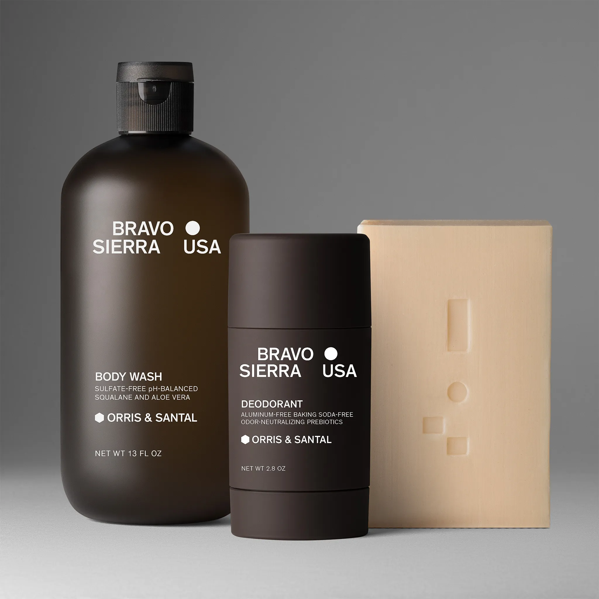
1. Provide hi-resolution and hi-quality images on the product page
First things first: images are a given now for every online store. They are a basic expectation of a customer on a product pages that convert. Great product imagery will not only increase your conversion but also will reduce your order return rates. The images supplied have to be:
- high resolution & high quality
- render correct, true-to-life color
- multiple (3-6 angles)
- only minimally retouched
Visitors will judge you by the first visual impression. It’s just how things work. So you better do your best to make people say “Oh wow”.

2. Provide video on your product page to breathe in life into an item
The video contributes to conversions and to your page on site stats, boosting your SEO results. Videos will increase your rankings in Google, leading to more traffic. Viewing a video takes an action – a user has to click a player, thus, ranking your site higher with search engines. So you may want to add videos to the best practices for your ecommerce product pages.
About minuses: videos might slow down your loading time and reduce time on page + increase the bounce rate. Ensure your website admin handles this downside by implementing a proper video optimization procedure. Product videos aimed to help an online store to:
- zoom in on details to render quality & nuance
- utilize emotional factor to stimulate the sale
- story-tell about the product
- upsell other items from a collection
If your budget is pretty tight – most of the tasks can be handled by product images, but your photographer should be much more experienced.
3. Implement GIFs on the product page to highlight major features
GIFs are a compromise between product photography and video. They don’t require any clicking, keeping the level of interest higher with smaller efforts. GIFs also consume less operational memory – being easier on the servers.
Electric appliances stores use this visual medium heavily – showcasing all the nuances of the design as well as the inner technicalities.
4. Ensure Product name is clearly visible, descriptive, catchy, SEO-friendly
Product name is the second thing in terms of visual hierarchy. A customer will check it out right after visuals provided on the product page of an online store. The product title should:
- be located above the fold and above or in line with the imagery
- be in H1 or H2 font for SEO purposes
- be precise but at the same time descriptive and catchy
- contain most used keyword in the segment or category /compare trendy “loafer” and mundane “shoes” – right you are, the shoes get more searches/
- not contain any item serial number or meaningless letter of digit combinations /it overloads crowded product page for no reason/
- contain your brand name.

If your company vision entails positioning as a lux item – a power move is to include it into every single product title. See how Gucci managed to introduce multiple keywords in this example below. Bravo, Maestro!

5. Product description section on the product page: the art of commercial storytelling
Product description plays 2 major roles: SEO and product awareness.
- SEO
In terms of the Search Engine Optimisation of the product page, you can’t do a better service to the ranking than to provide a unique description full-yet-not-spammed with keywords. Using H2-H3 heading fonts if you do a few paragraphs of words is ideal.
In a nutshell, all the rules apply in terms of content on the product page like those that apply to the home page. The earlier in the text the words appear – the more important they are perceived by an algorithm. The less repetitive they are from page to page – the better it is for SEO.
Keep in mind, luxury products allow more flowery words than the mass market or mid-market lines. Too much pathos on a $15 shirt could do more harm than good, repelling a potential customer as wrongly targeted.
- Product awareness
The product description should speak to the target audience in the vocabulary pertinent to the target audience. In the tone of voice familiar for the target audience. With messages dear to the target audience.
You got it right. Even though you might be describing a pair or trivial waxed cotton shoelaces in most of the classic mundane black color. Are you targeting cowboys? Your text should reflect that. Is your target audience hipsters? You definitely want that hipsterish tone of voice. What is medicine for one is poison for the other – don’t confuse the two.
6. Product details and technical parameters on the product page
Those include color, sizes, materials used for clothing items and memory, screen diameter, display resolution and the like for phone merchandise – you get the logic. Everything that matters for purchasing intent should be put in a bigger font and higher above in the section.
All the legal or purely technical info hardly makes any impact in terms of conversion. Hence, can be kept in more discreet font colors and sizes in terms of visual hierarchy. Such an approach helps web designers to keep the screen cleaner and less crowded.
7. The price tag in the web design: justifying your “how much”
Price-wise there are a number of strategies to be considered and employed. Yet, make sure the font you chose is clearly visible but not overpowering. It should speak in a calm assertive tone. Even if your e-commerce store sells premium products.
The price tag should be rendering the message in a firm confident yet respectful manner: “yes, I am expensive, but I am worth it”. Not a shy “well, I am on the pricey side of things, but should you dare to try me, in all probability, you might enjoy me rather than otherwise”, then it will be ecommerce product page best practices.
Left digit psychology does work. It’s still a great conversion booster, specifically for those in the lower price range categories. Developed economy and a fierce fight for client’s budgets made the majority of stores absolute admirers of the 99 trick. That should be avoided in the premium segment: use the reverse effect. Clients may feel emotionally superior when not buying for that trick.

8. Discounts, sale countdown, and sale banners
The times have gone when customers had unshakable trust in the seconds ticking away on the timer set on the product page. More and more tech-savvy guys appear on planet earth. So unless your target audience is definitely tech-retarded, your customers will know this timer will renew itself tomorrow and is programmed to put pressure on buyers. In which case, the timer might also play a deterring effect. Nobody likes cheap tricks on them.
Unless this is that magic period of the year when all stores have that words “sale” all over their shop windows. In which case not having a timer / a discount badge / a “now and before” price should be illegal. It is criminal to your sales anyway.
9. Trust badges are there to build up trust
If your website is protected to perform secure credit card transactions – the customer should know it. If your product has been awarded a Red Dot design prize – your client must know about it. If you have worked hard to make your website a secure place and if your product is recognized by business society – make sure you reflect it on the product page. If there is any relevant place for social proof – this is a product page of an e-commerce website.
10. Reviews on the product page – the mustest of all must-haves
Most successful clothing online shops allow plenty of comments by genuine clients. You can feel by the tone of voice, the grammar, the structure when the review is genuine or paid for.
Such comments not only are likely to have a positive or negative opinion on the purchased item. They state things like: if the color on the image is true-to-life or not; if the size is regular or smaller or larger than regular; if the fabric feels natural against the body or synthetic and itchy.
Such comments work as social proof, increase time-on-page and SEO. They also function as the dominant factor for the painfully costly return rate reduction. Because clients have found out, the size in on the larger side of the spectrum – they order the right size right away. Because a client read, that color works miracles against another buyer with the same complexion.
LOOX app allows customers to share their photo reviews on your website in exchange for discounts. The social proof in the comforting environment of social media is worth to check out.
11. CTA: a call to action is a product page’s major conversion booster factor
Call To Action element of the product page is worth a huge chapter on its own. We find a piece by WordStream rather useful on best practices for an effective call to action buttons.
Still, if we were to provide a few main tips, they would be:
- Make sure it’s an imperative statement with a verb in it.
- Go creative if pertinent to your business niche and keep CTAs consistent throughout the entire website accordingly.
- Don’t do 1-word CTAs but don’t go above 5 words on the main line of CTA button: 2-to-4 is an ideal size of the statement.
- Mentioning a discount or and value add is OK on a CTA. Some designs of the button allow for the second line in neutral grey-to-black fonts. However small – everybody notices a discount.
- Make sure the colors are bright and contrasting against the background – classical orange or green are reported to convert nicely.
- Keep it in the spot that is natural in terms of the user journey and UX – when the person is informed enough about all offers and product particulars. You don’t want your Add to cart appear at the beginning of the page before the product, right?
- Use visual hierarchy to drive people to your primary CTA button: if you have 2 or 3 buttons to choose from, the preferable action should be based higher and in brighter colors. See below an example from Macy’s product page, whereby 2 buttons don’t compete with each other:

12. Social media sharing buttons are a new norm – on all pages
Irrespective of what the content of a webpage is about, social media sharing buttons are an expectation. It is just good digital customer service after all. It is providing your customer with a shortcut to potential action – instead of a few clicks, they only need to make one.
Social media buttons are also a reminder to perform an action – a trigger with the icons of much-adorable favorite cyber networks.
So it is good digital customer service and good digital manners to embed social media sharing icons on every page in this era.
13. Helpline contacts or chat: showing care to your client
Talking about customer service – it is only natural to have a means of contacting with somebody live right now – in case any questions occur or fine print is too fine.
Whatever you choose – be it a 0800 toll-free number or a live chat, that has 24/7 support team servicing it – having a person to speak to is a much-advised component of a product page. MarTech reports that 51% of the surveyed clients confirmed they are more likely to buy from e-commerce business with live chat functionality.
14. Refund & satisfaction guarantee – buy with confidence
Many clients will check the refund policy before proceeding to the cart. Knowing, that the refunding of merchandise is possible, increases conversions significantly.
Make sure to display the refund and satisfaction guarantee policies somewhere in the eye’s reach from the CTA button. This is how customers know they are entering into a legitimate transition with a reputable store who cares about their interests.
When creating a product page you must take into account a myriad of factors in order for it to convert. Start with our guide as your online store checklist for better conversions on product pages.
The optimization of the product page should be an ongoing process. AB tests are a must. Testing the shape of a CTA button, the font size of the product title or the color of the discount message is the only way to push your conversions higher.
You don't know what will bring you the desired reaction: one of our clients – iQ Natural, the beauty company, achieved a +20% sales growth after they changed their product images. Learn more about their story.
There is only space for this many unicorn businesses, that boast 49% PCR – the average is much more modest after all. As long as you keep checking trends and applying tests to increase conversion from month to month – you are on the right track. Keep doing a great job!


Product A
SQUARE SHOT